d <- tibble(A = c(1, 2, 3, 5), B = c(2, 6, 4, 4.5))
ggplot(data = d) + geom_line(mapping = aes(x = A, y = B))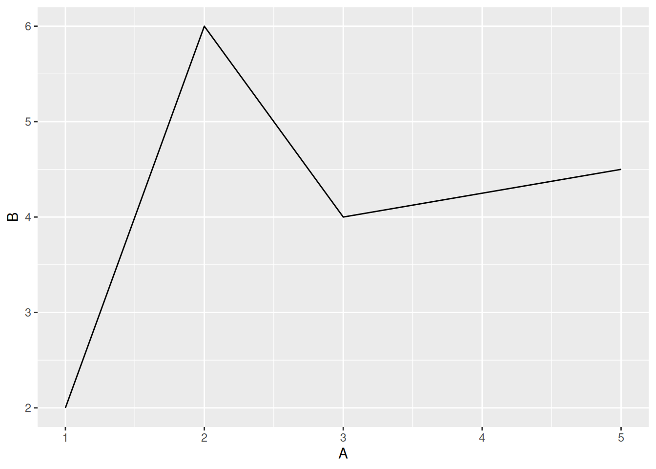
geom_line()geom_line()d <- tibble(A = c(1, 2, 3, 5), B = c(2, 6, 4, 4.5))
ggplot(data = d) + geom_line(mapping = aes(x = A, y = B))
geom_line() funktioniert im Prinzip genau wie geom_point()ggplot(data = d_wb_countries) +
geom_line(mapping = aes(x = year, y = gdp))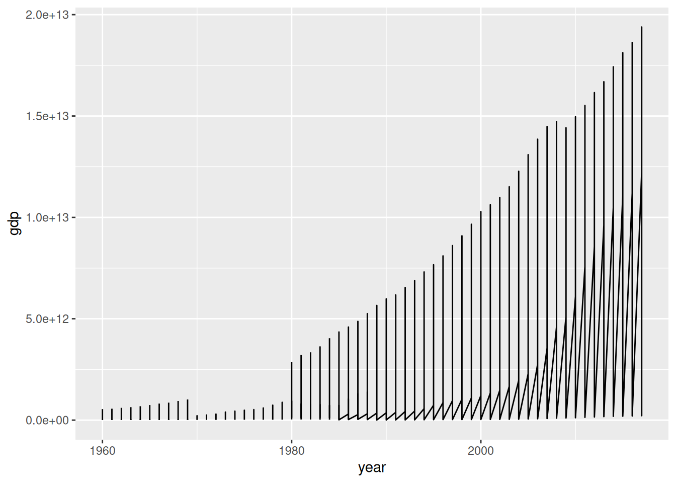
ggplot(data = d_wb_countries) +
  geom_line(mapping = aes(x = year, y = gdp, group = country))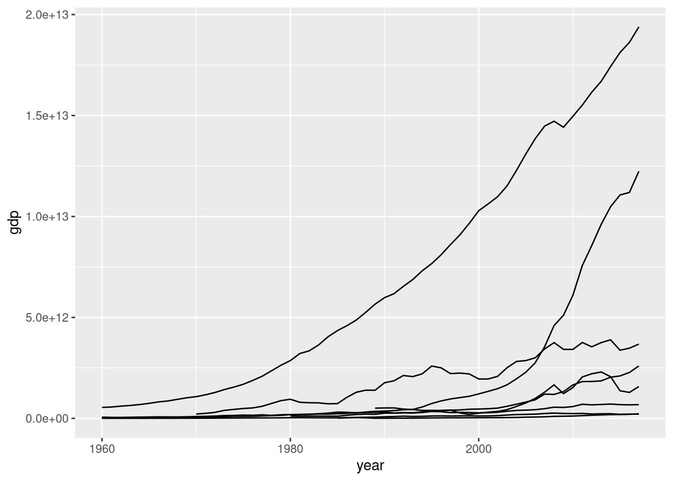
group = <M> angegeben, welche Punkte zusammengehörenggplot(data = d_wb_countries) +
geom_line(mapping = aes(x = year, y = gdp, color = country, group = country))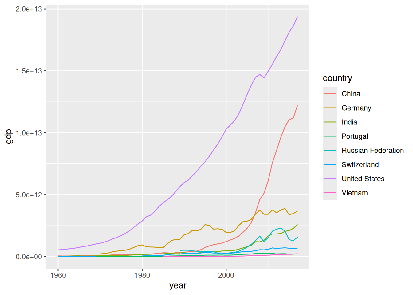
color = cggplot(data = d_wb_countries) +
geom_line(mapping = aes(x = year, y = gdp, color = country, linewidth = pop), lineend = "round")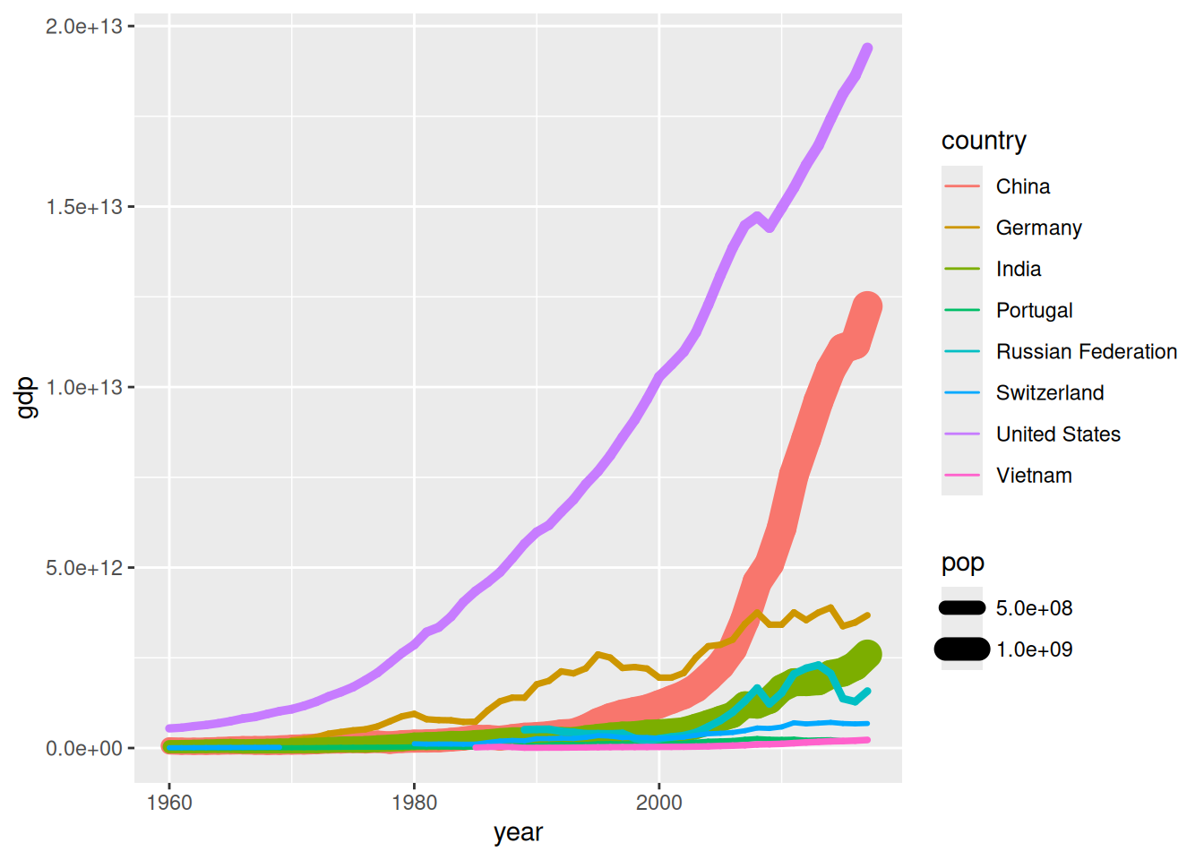
size = s legt Linienstärke festlineend = "round" bei sehr dicken Liniengeom_segment()ggplot(data = d_wb_countries_2012) +
geom_segment(mapping = aes(x = 0, xend = pop, y = country, yend = country)) +
geom_point(mapping = aes(x = pop, y = country), color = "red")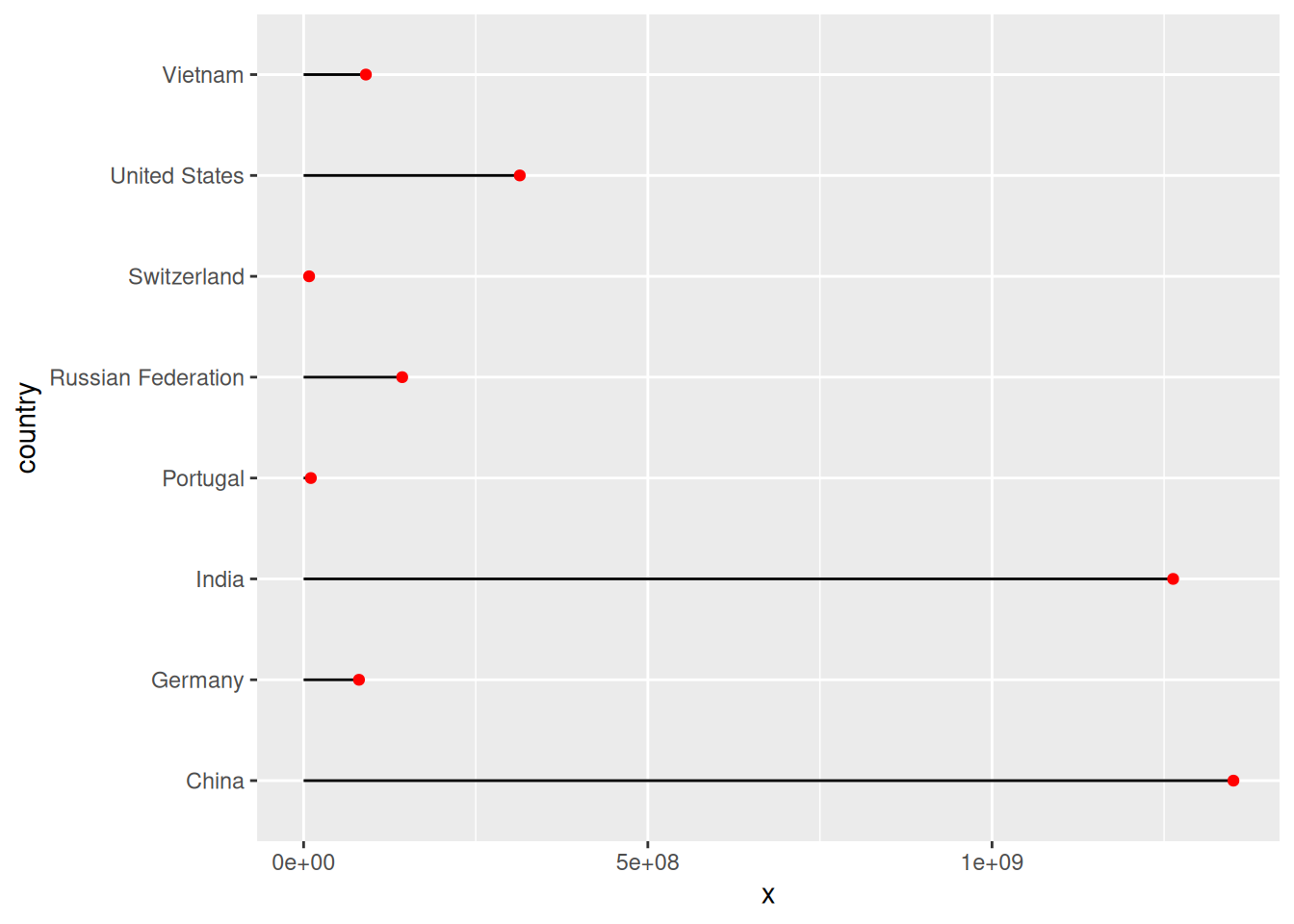
x, y, xend, yend, auch mit festen Wertengeom_segment()ggplot(data = d_wb_countries_2012) +
geom_segment(mapping = aes(x = 0, xend = pop, y = country)) +
geom_point(mapping = aes(x = pop, y = country), color = "red")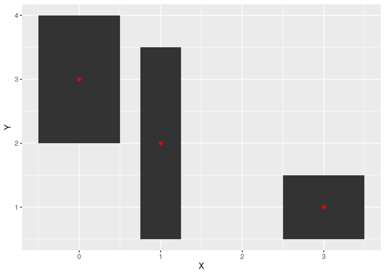
geom_tile()d <- tibble(X = c(0, 1, 3), Y = c(3, 2, 1), W = c(1, 0.5, 1), H = c(2, 3, 1))
ggplot(data = d) +
geom_tile(mapping = aes(x = X, y = Y, width = W, height = H)) +
geom_point(mapping = aes(x = X, y = Y), color = "red")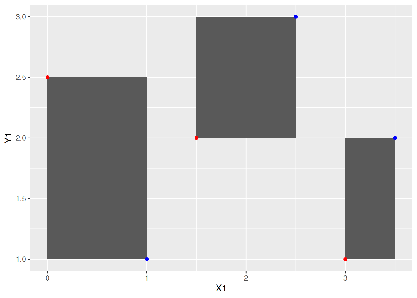
geom_rect()d <- tibble(X1 = c(0, 1.5, 3), Y1 = c(2.5, 2, 1), X2 = c(1, 2.5, 3.5), Y2 = c(1, 3, 2))
ggplot(data = d) +
geom_rect(mapping = aes(xmin = X1, ymin = Y1, xmax = X2, ymax = Y2)) +
geom_point(mapping = aes(x = X1, y = Y1), color = "red") + geom_point(mapping = aes(x = X2, y = Y2), color = "blue")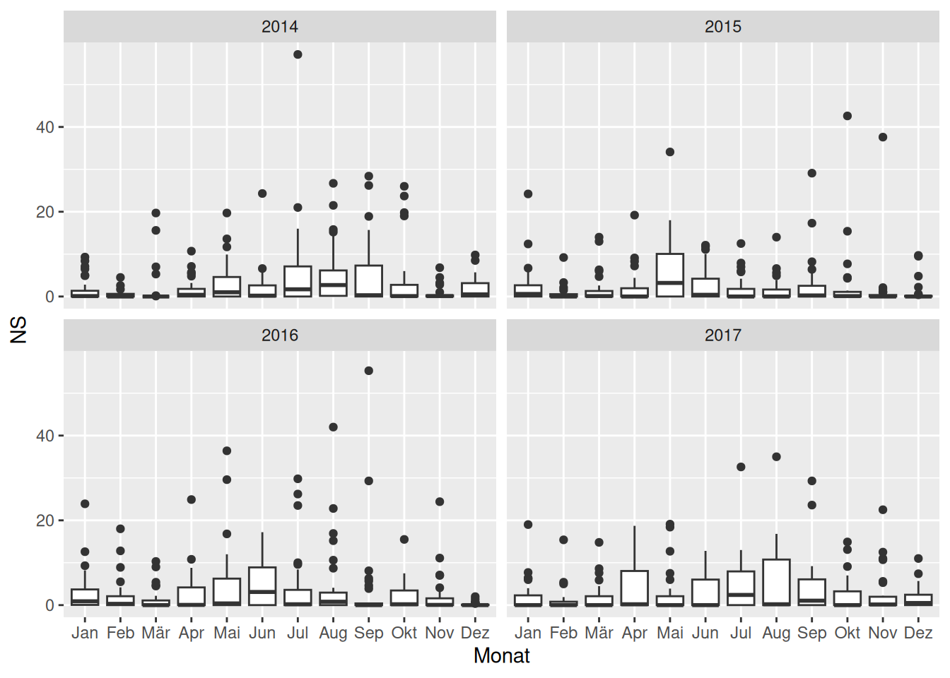
facet_wrapggplot(data = filter(d_ns_bochum_tag, Jahr %in% 2014:2017)) +
geom_boxplot(mapping = aes(x = Monat, y = NS)) +
facet_wrap(~Jahr, ncol = 2)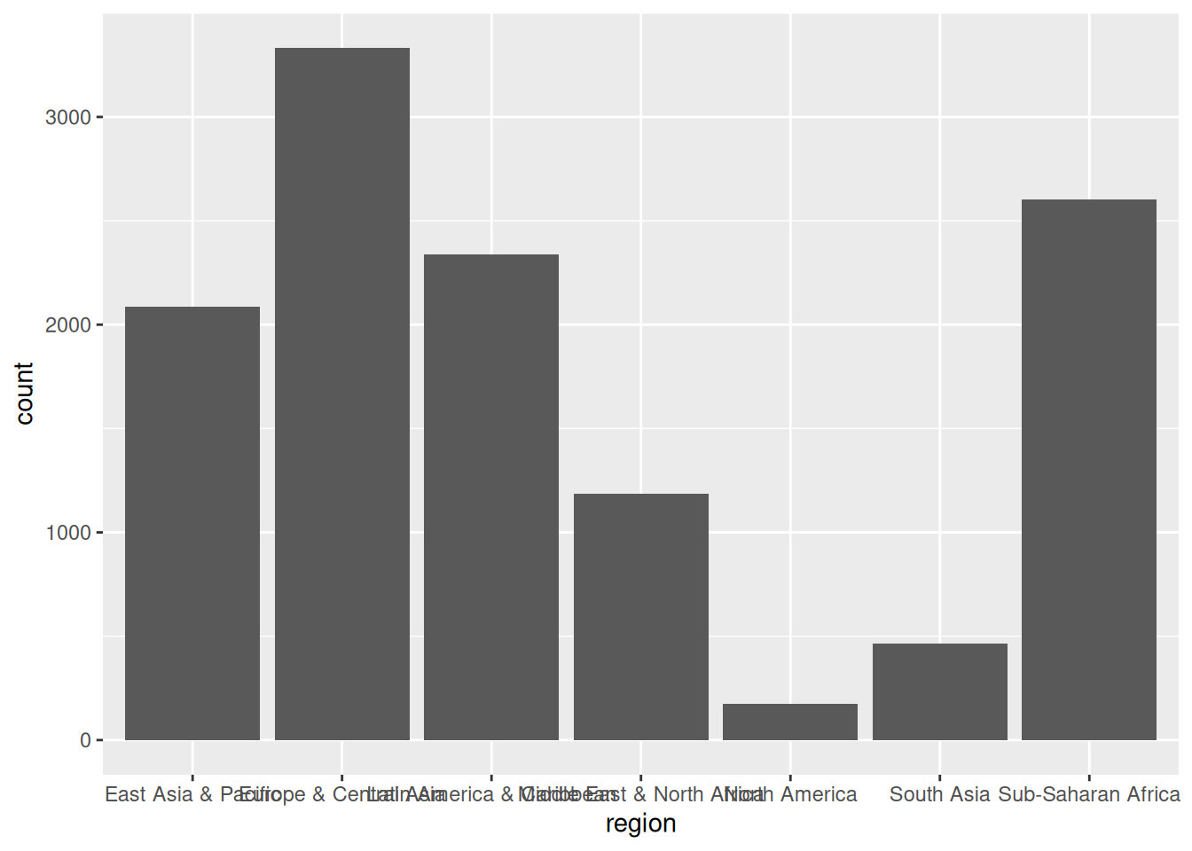
facet_wrap(~Merkmal): Für jede Ausprägung des Merkmals ein Plotnrow = nr oder ncol = ncfilter() (später ausführlich)ggplot(d_wb_all) +
geom_bar(mapping = aes(x = region))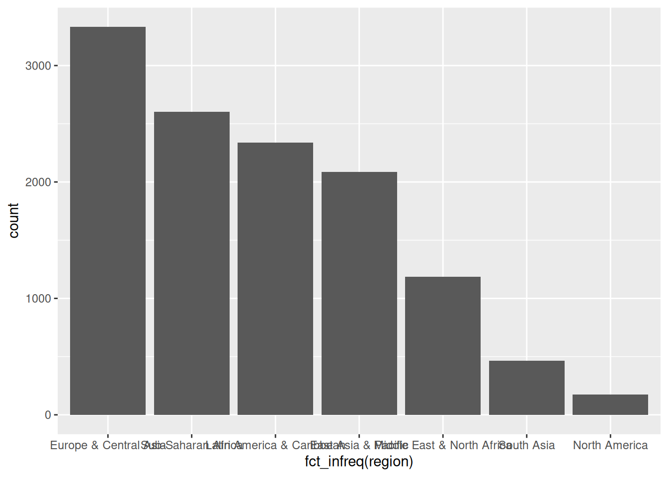
ggplot(d_wb_all) +
  geom_bar(mapping = aes(x = fct_infreq(region)))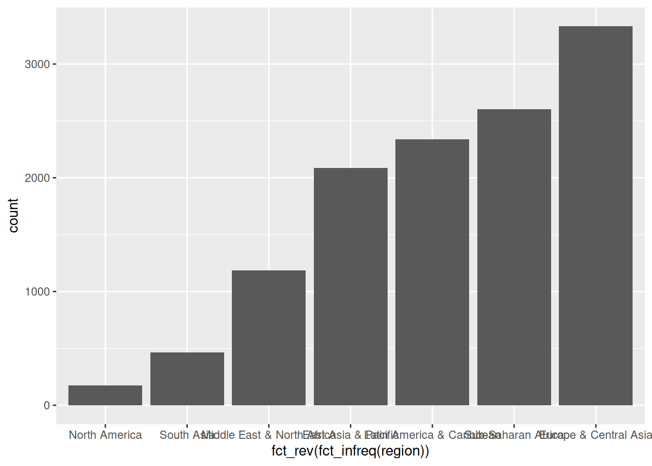
fct_infreq()ggplot(d_wb_all) +
geom_bar(mapping = aes(x = fct_rev(fct_infreq(region))))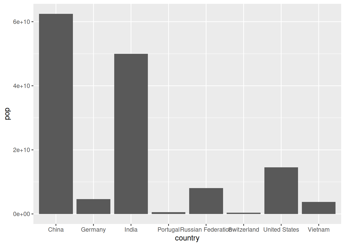
fct_rev(), rev wie reverse = umgekehrtggplot(d_wb_countries) +
geom_col(mapping = aes(x = country, y = pop))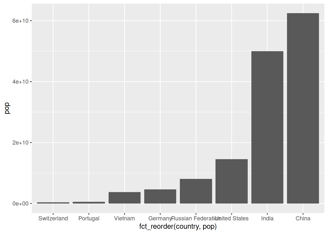
ggplot(d_wb_countries) +
  geom_col(mapping = aes(x = fct_reorder(country, pop), y = pop))
fct_reorder()ggplot(d_wb_countries) +
geom_col(mapping = aes(x = fct_rev(fct_reorder(country, pop)), y = pop))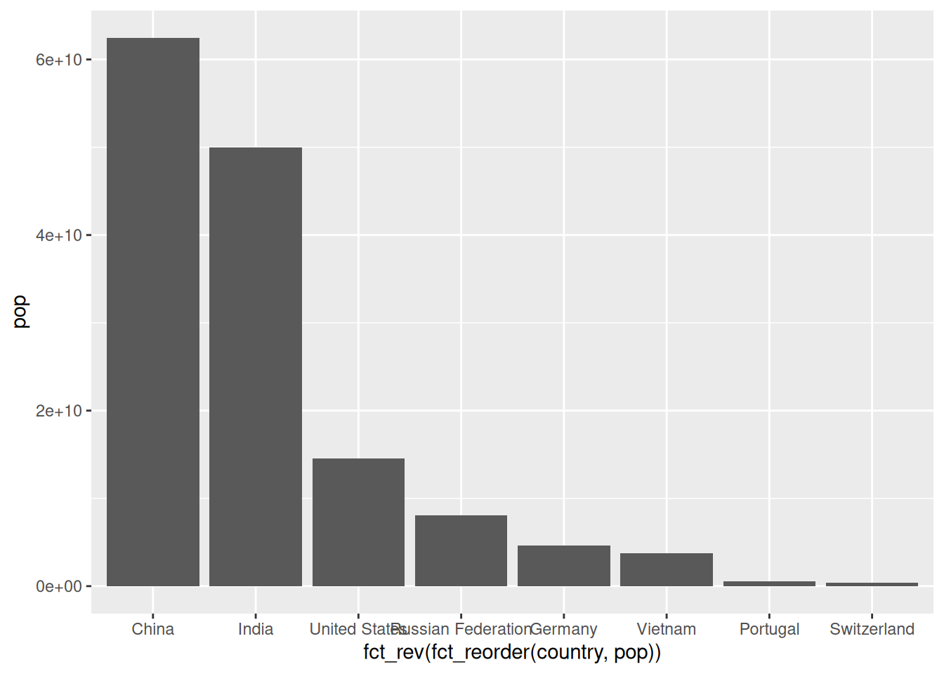
fct_rev()
Skalen regeln die Abbildung von Daten auf die Eigenschaften geometrischer Objekte (AES).
Form der Angaben zu Skalen: scale_AAA_BBB(<Arguments>)
| AAA | BBB | Funktion |
|---|---|---|
x, y |
continuous, discrete | Koordinatenachsen konfigurieren |
x, y |
reverse, sqrt, log10 | Koordinatenachsen transformieren |
color, fill |
grey, hue, manual, brewer, … | Farbe und Füllfarbe ändern |
Darüber hinaus gibt es Skalen für alle anderen visuellen Eigenschaften (Transparenz, Linientyp, Shape, …). In der Regel muss man diese aber nicht anpassen.
Werden keine Skalen angegeben (so wie bisher), dann fügt ggplot automatisch sinnvolle Skalen ein. Aus
ggplot(data = d_wb_all) +
  geom_point(mapping = aes(x = year, y = gdp))
wird daher
ggplot(data = d_wb_all) +
  geom_point(mapping = aes(x = year, y = gdp)) +
  scale_x_continuous() +
  scale_y_continuous()
Skalen anpassen: Selber dazuschreiben
ggplot(data = d_wb_all) + geom_point(mapping = aes(x = year, y = gdp)) +
  scale_x_continuous(breaks = c(1965, 1990, 2015))
breaks = b
| Argument | Beschreibung |
|---|---|
breaks |
Vektor mit Werten für Achspunkte |
minor_breaks |
Vektor mit Werten für zwischen-Achspunkte |
limits |
Vektor mit zwei Elementen für Begrenzung |
labels |
Vektor mit Beschriftung (selten) |
breaks = NULL bzw. minor_breaks = NULLlimits werden die entsprechenden Daten vor dem Plotten entfernt (manchmal nicht erwünscht). Alternativ die Plotgrenzen bei coord_cartesian() angeben (gleich)ggplot(data = d_wb_2012) + geom_bar(mapping = aes(x = region)) +
scale_x_discrete(labels = c("A", "B", "C", "D", "E", "F", "G"))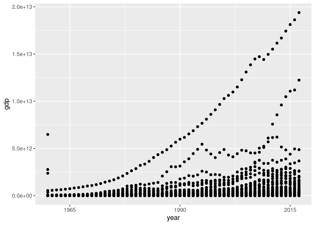
labels = lggplot(data = d_wb_2012) +
geom_point(mapping = aes(x = gdp, y = gge, fill = region, size = pop), shape = 21)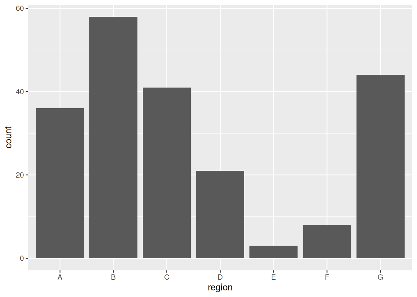
ggplot(data = d_wb_2012) +
geom_point(mapping = aes(x = gdp, y = gge, fill = region, size = pop), shape = 21) +
scale_x_log10() + scale_y_log10()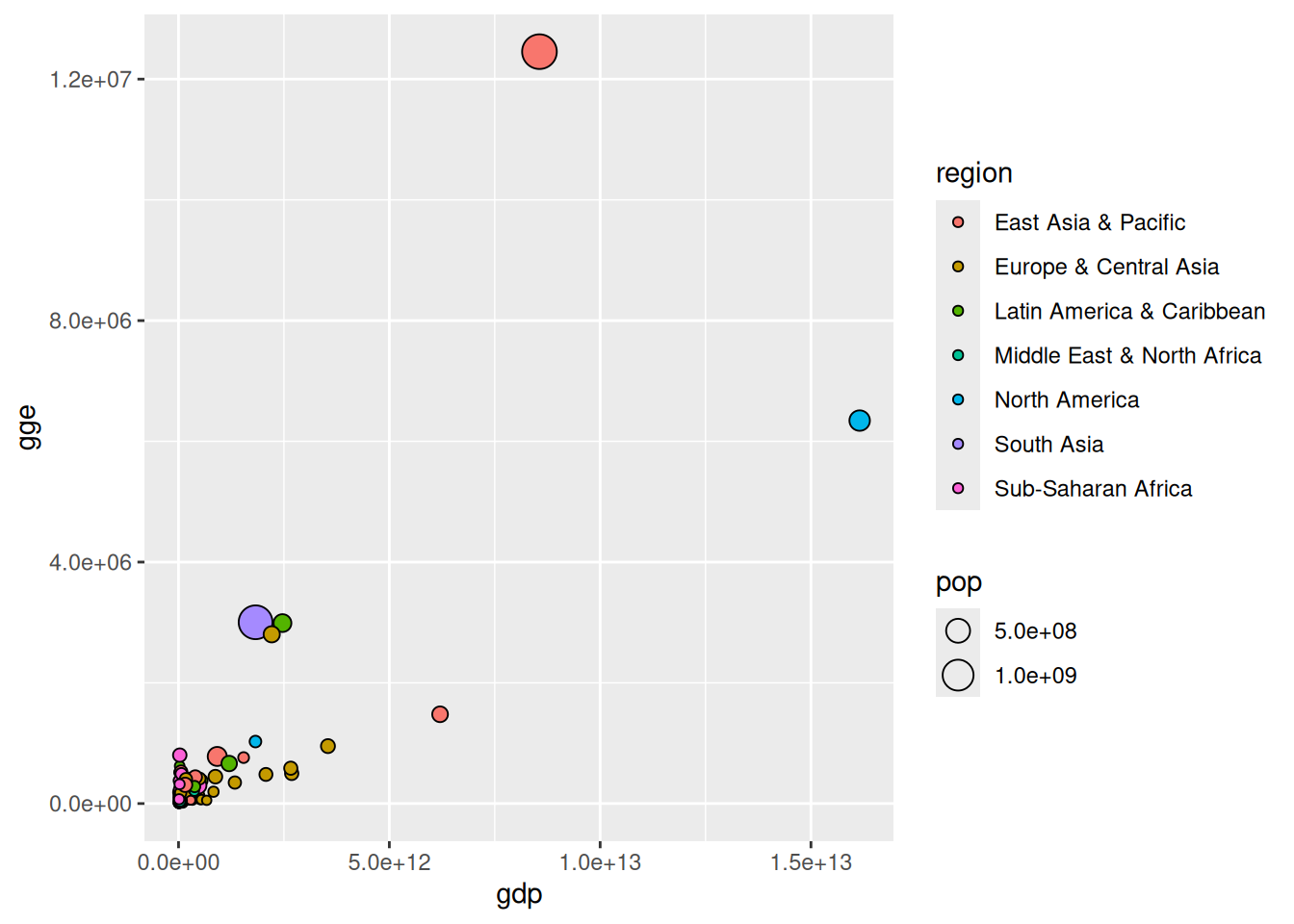
| x-Achse | y-Achse | Wirkung |
|---|---|---|
scale_x_sqrt() |
scale_y_sqrt() |
Wurzelskala |
scale_x_log10() |
scale_y_log10() |
Logarithmische Skala |
scale_x_reverse() |
scale_y_reverse() |
Umgedrehte Skala |
→ Definitionsmenge von Logarithmus und Wurzel beachten
Datensatz: Sinuskurve
d <- tibble(X = seq(0, 2, by = 0.05), Y = sin(pi * seq(0, 2, by = 0.05)))ggplot(data = d) + geom_col(mapping = aes(x = X, y = Y, fill = Y)) +
scale_fill_gradient(low = "green", high = "red")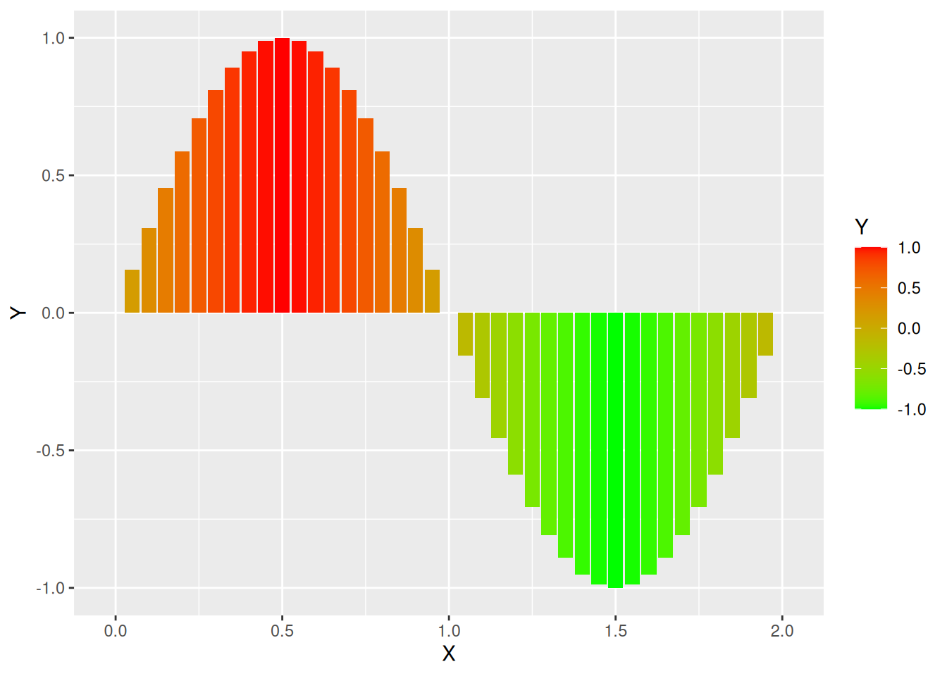
scale_fill_gradient() erzeugt Farbverlauf mit zwei Farbenggplot(data = d) + geom_col(mapping = aes(x = X, y = Y, fill = Y)) +
scale_fill_gradient2(low = "orange", mid = "yellow", high = "green")
scale_fill_gradient2() erzeugt Farbverlauf mit drei Farbenggplot(data = d) + geom_col(mapping = aes(x = X, y = Y, fill = Y)) +
scale_fill_distiller(palette = "RdBu")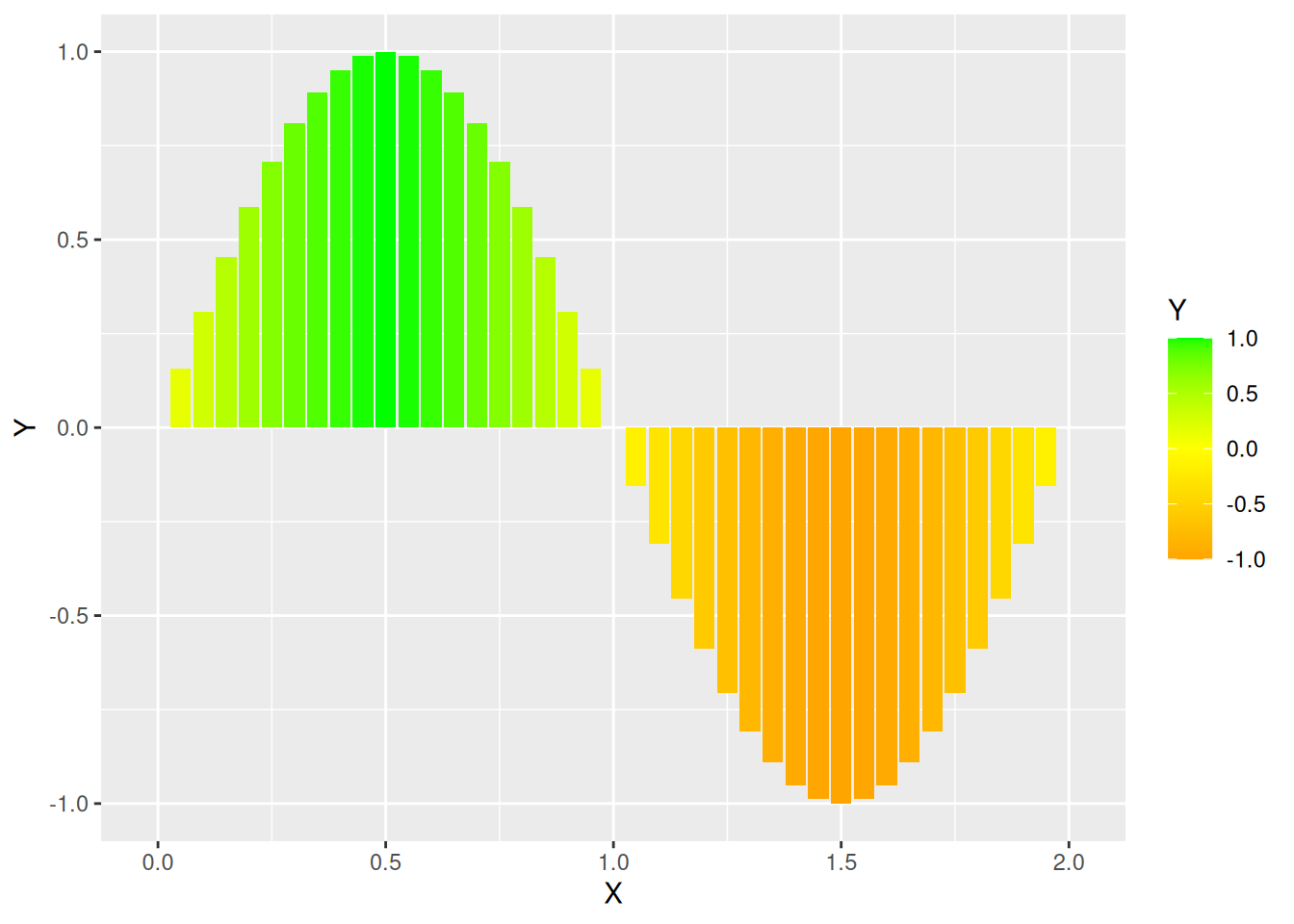
ggplot(data = d) + geom_col(mapping = aes(x = X, y = Y, fill = Y)) +
  scale_fill_distiller(palette = "RdBu", direction = 1)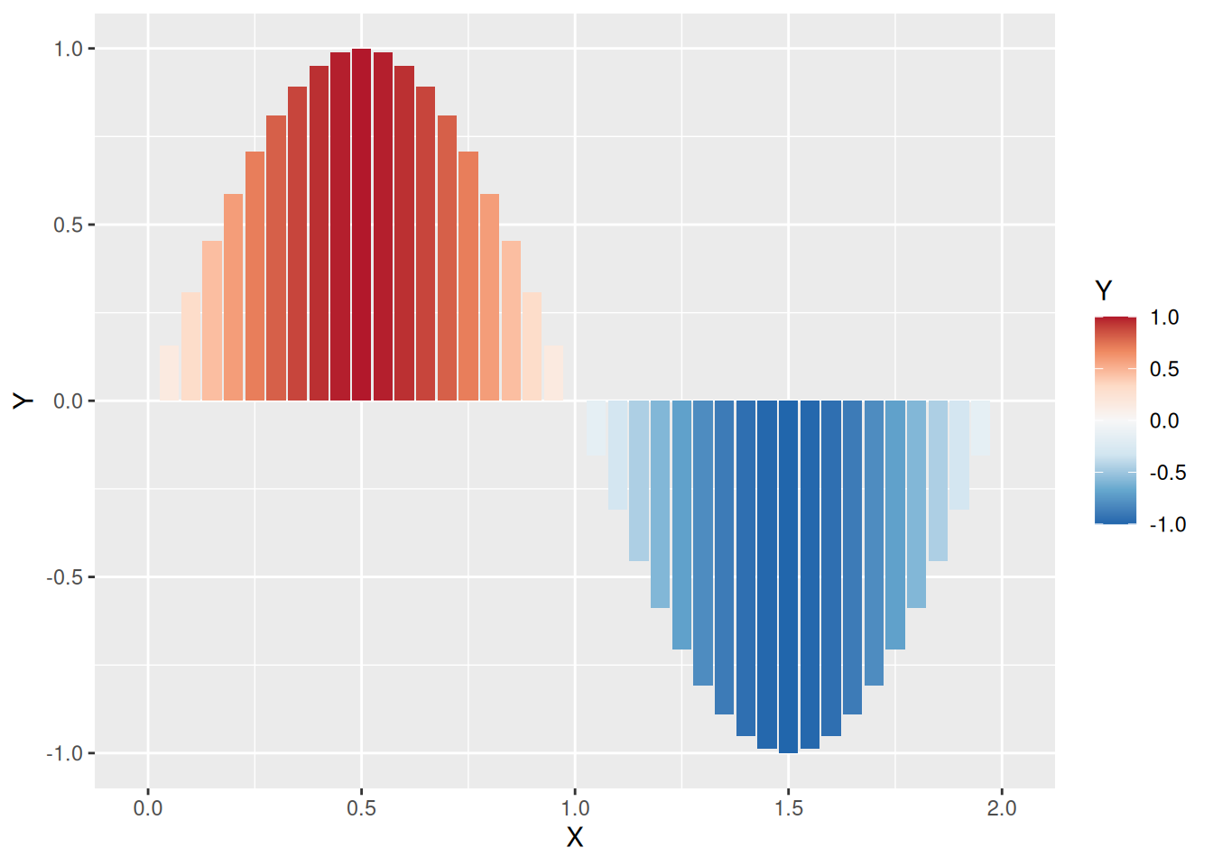
direction = 1 Farbskala umdrehenggplot(data = d) + geom_col(mapping = aes(x = X, y = Y, fill = Y)) +
scale_fill_distiller(palette = "RdBu", direction = 1, guide = "legend")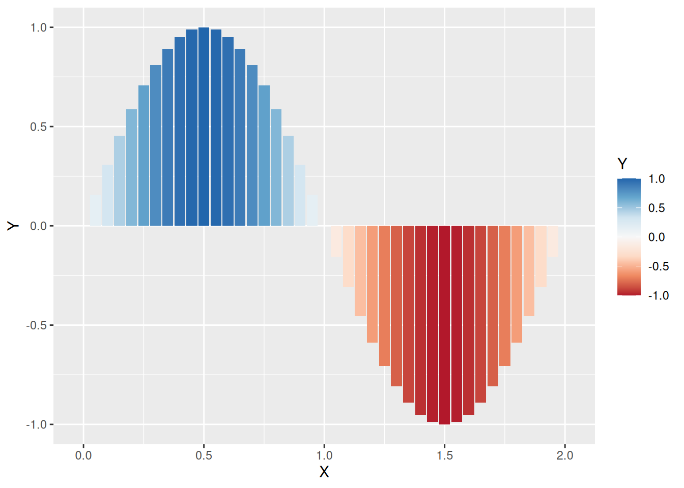
guide = "legend" die Darstellung der Farblegende anpassenggplot(data = d) + geom_col(mapping = aes(x = X, y = Y, fill = Y)) +
scale_fill_fermenter(palette = "RdBu", direction = 1)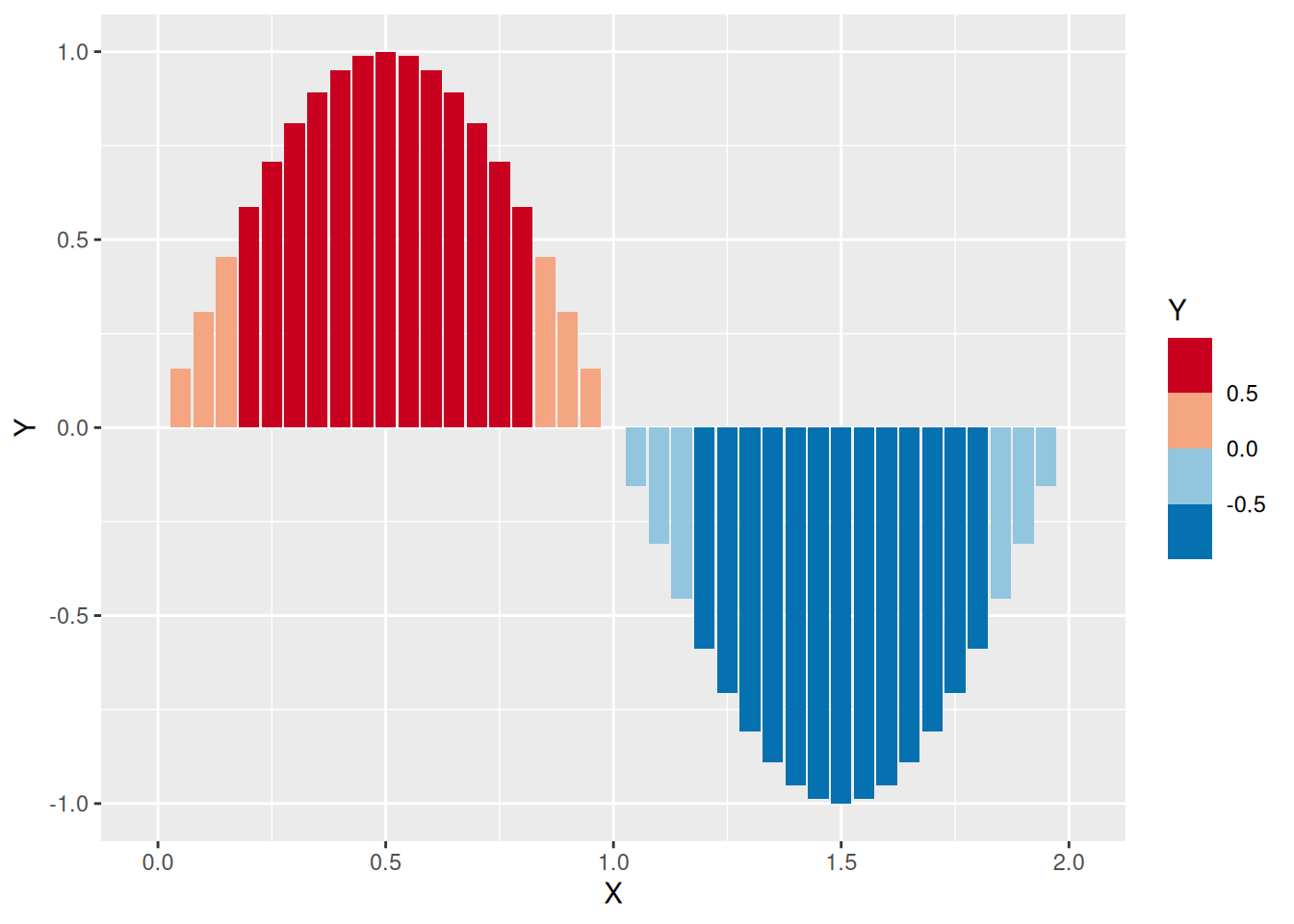
ggplot(data = mutate(d, Y = Y^16 + 1e-15)) +
  geom_col(mapping = aes(x = X, y = Y, fill = Y)) +
  scale_fill_fermenter(palette = "RdBu", trans = "log10") +
  scale_y_log10()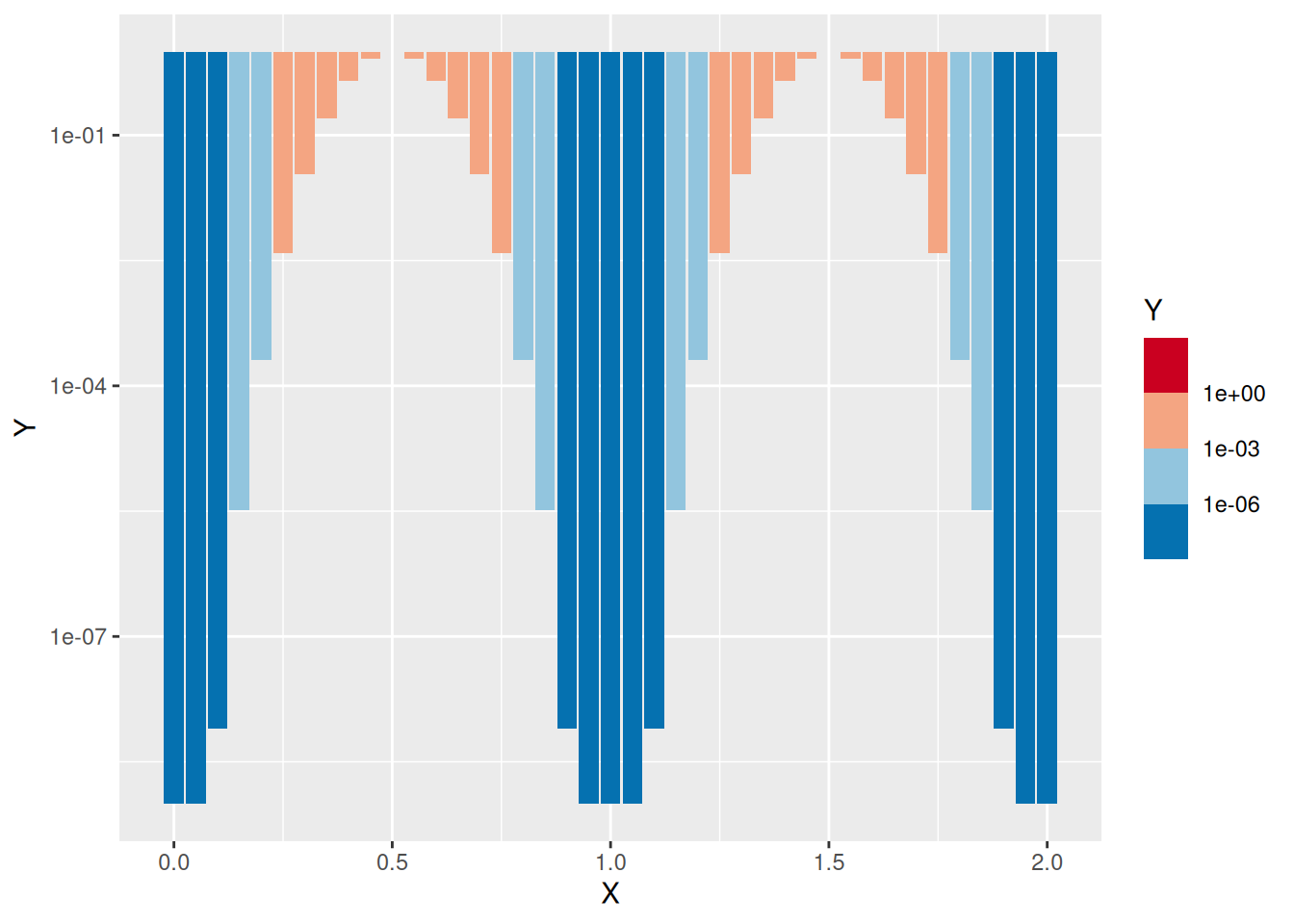
trans = "log10" dem Logarithmus der Werte zuordnen
| Element | Argumente | Funktion |
|---|---|---|
scale_AAA_gradient |
low, high |
Farbverlauf von low nach high |
scale_AAA_gradient2 |
low, mid, high |
Farbverlauf mit drei Farben |
scale_AAA_distiller |
palette |
Brewer-Farbpaletten |
scale_AAA_fermenter |
palette |
Brewer-Farbpaletten mit Klassen |
→ Für AAA je nach Anwendung entweder ‘color’ oder ‘fill’ einsetzen
| Option | Mögliche Werte | Funktion |
|---|---|---|
direction |
1, -1 | Richtung der Farbskala |
guide |
“colourbar”, “legend” | Kontinuierliche Skala oder diskrete Farben |
trans |
“idendity”, “log10”, … | Transformation für Werte |
d <- tibble(farbe = c("rot", "grün", "blau", "grün", "rot", "grün"))
ggplot(data = d) +
  geom_bar(mapping = aes(x = farbe, fill = farbe)) +
  scale_fill_manual(values = c("red", "blue", "green"))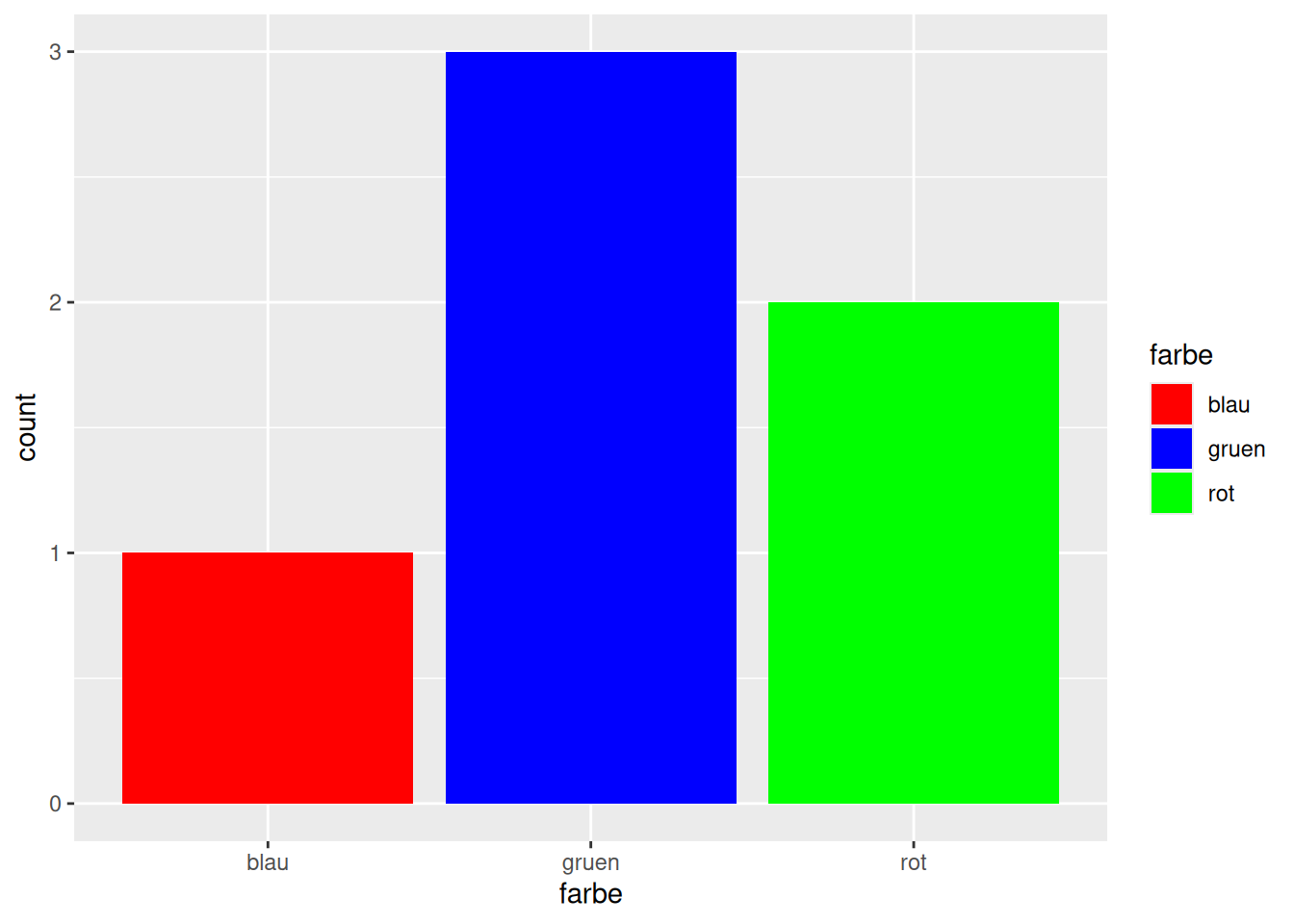
d <- tibble(farbe = c("rot", "grün", "blau", "grün", "rot", "grün"))
ggplot(data = d) +
  geom_bar(mapping = aes(x = farbe, fill = farbe)) +
  scale_fill_manual(values = c("rot" = "red", "blau" = "blue", "grün" = "green"))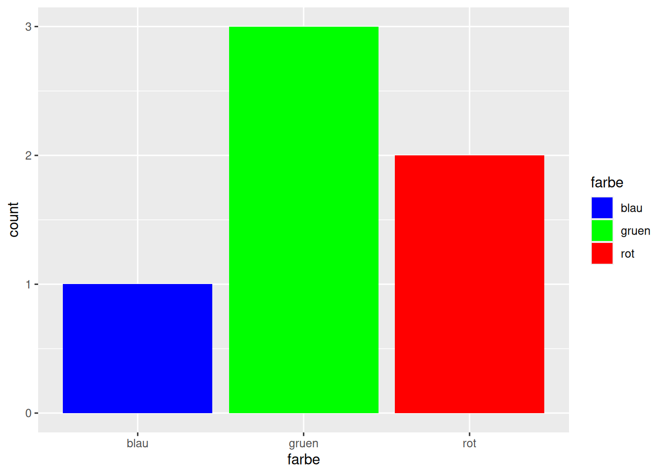
Ausprägung = Farbe angebenggplot(data = d_wb_2012) + geom_bar(mapping = aes(x = region, fill = region)) +
scale_fill_brewer(palette = "Set1")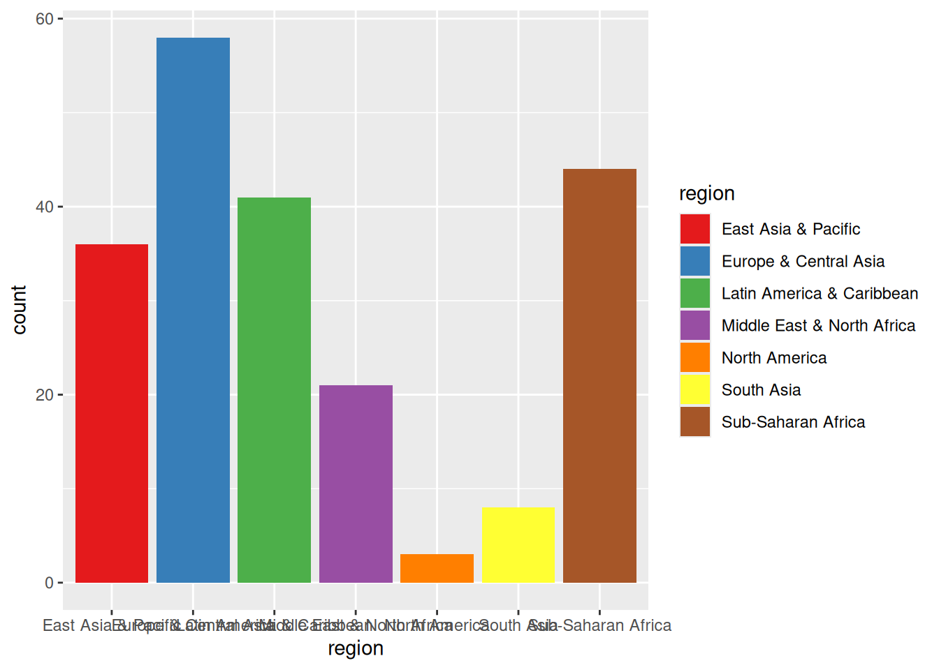

scale_color_distiller(palette = p) oder scale_fill_distiller(palette = p)scale_color_brewer(palette = p) oder scale_fill_brewer(palette = p)
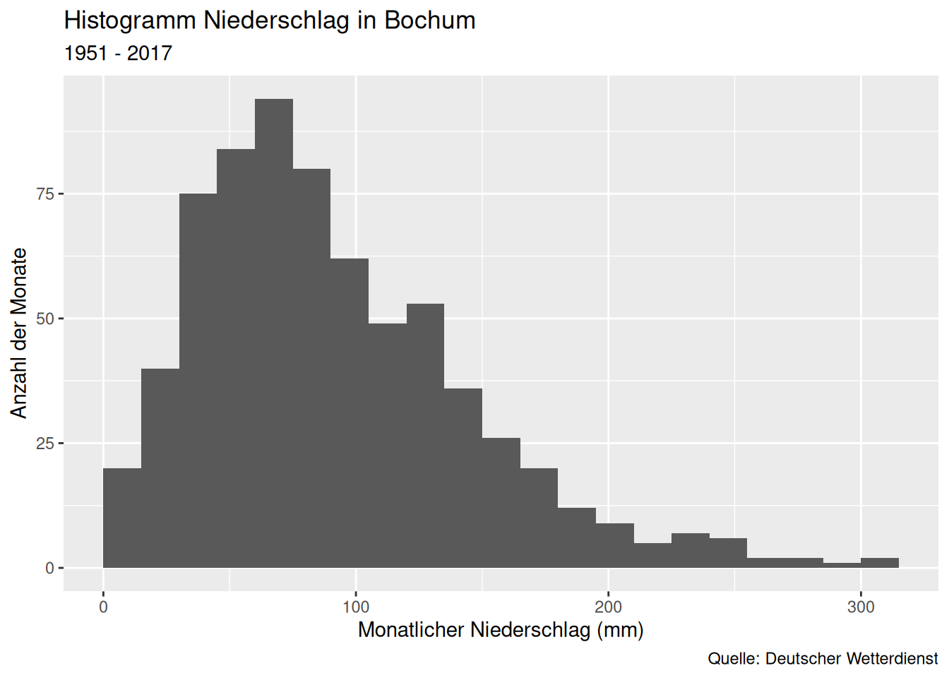
labs()ggplot(data = d_ns_bochum_monat) +
geom_histogram(mapping = aes(x = NS), binwidth = 15, boundary = 0) +
labs(
title = "Niederschläge in Bochum", subtitle = "1951 - 2017",
x = "Monatlicher Niederschlag (mm)", y = "Anzahl der Monate",
caption = "Quelle: Deutscher Wetterdienst"
)
ggplot(data = d_wb_2012) + geom_bar(mapping = aes(x = region, fill = region)) +
  labs(fill = "Weltregion")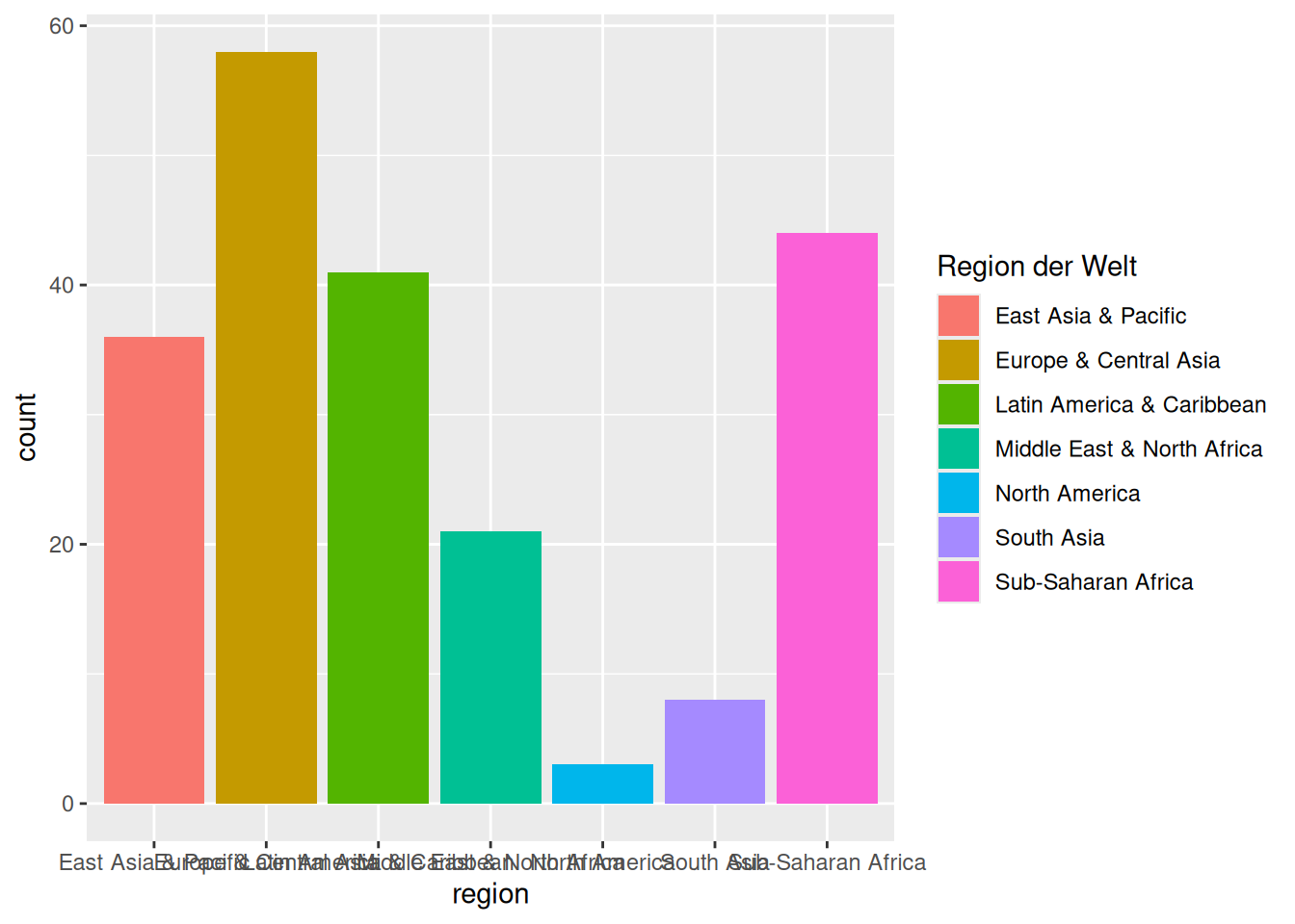
labs beschriftenfill = Titelggplot(data = filter(d_ns_bochum_monat, Jahr >= 2000)) +
geom_boxplot(mapping = aes(x = factor(Jahr), y = NS)) +
labs(x = NULL, y = NULL)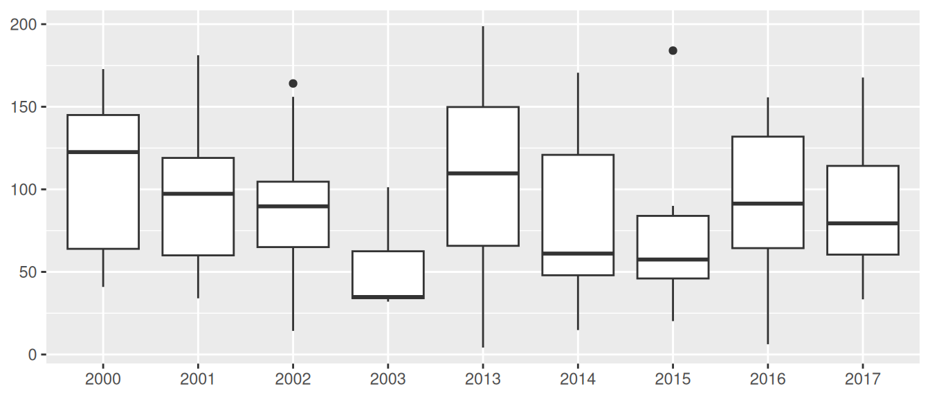
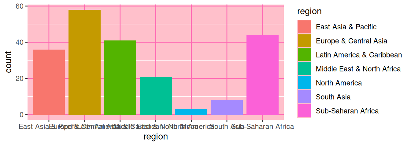
NULL entfernt die Beschriftung und den dafür reservierten Platzggplot(data = d_wb_2012) +
geom_bar(mapping = aes(x = region, fill = region)) +
guides(x = guide_axis(angle = 45))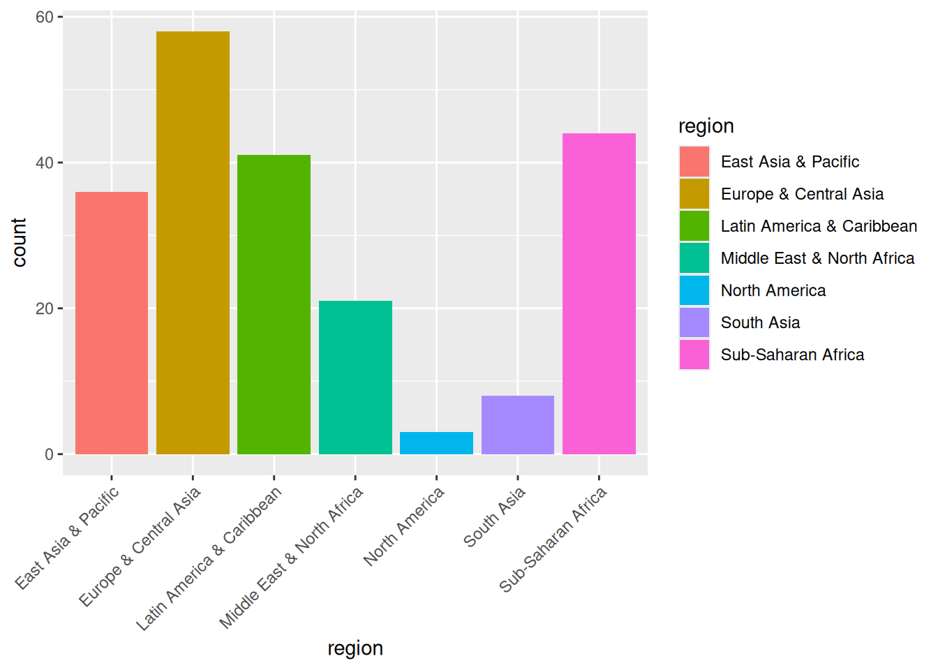
ggplot(data = d_wb_2012) +
  geom_bar(mapping = aes(x = region, fill = region)) +
  guides(x = guide_axis(n.dodge = 3))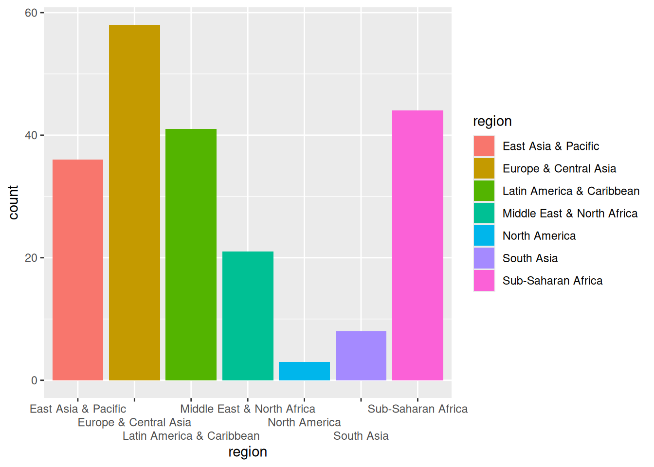
coord_flip()ggplot(data = d_wb_2012) +
geom_bar(mapping = aes(x = region, fill = region)) +
coord_flip()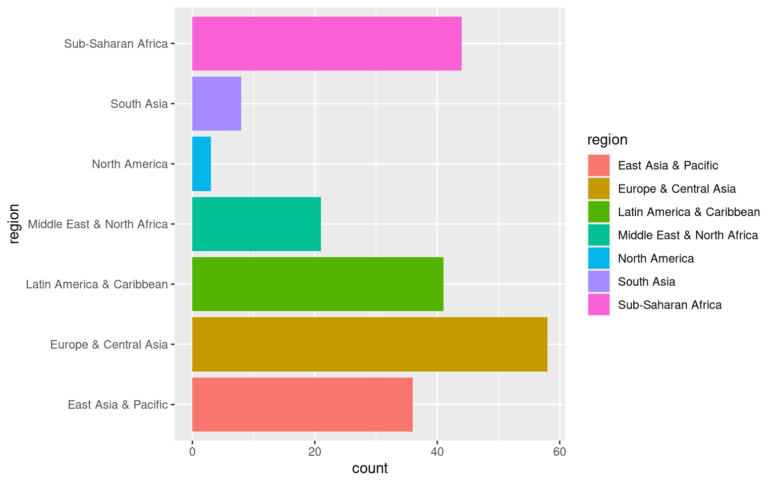
coord_cartesian()ggplot(data = d_wb_countries) +
geom_ribbon(mapping = aes(x = year, ymin = 0, ymax = gdp, color = country, fill = country), alpha = 0.3) +
coord_cartesian(xlim = c(1980, 2010), ylim = c(0, 4e12))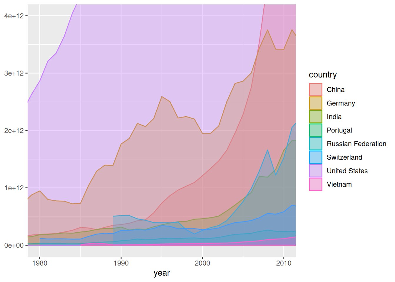
xlim = c(xmin, xmax) und ylim = c(ymin, ymax)coord_polar()ggplot(data = d_wb_countries) +
geom_ribbon(mapping = aes(x = year, ymin = 0, ymax = gdp, color = country, fill = country), alpha = 0.3) +
coord_polar(theta = "y")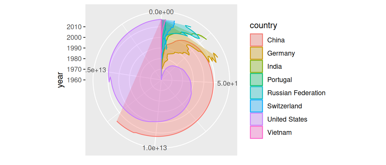
"x" oder "y") für Winkel mit thetaggplot(data = d_wb_countries_2012) +
geom_col(mapping = aes(x = 0, y = gge, fill = country), color = "black", width = 1) +
coord_polar(theta = "y") + theme_void()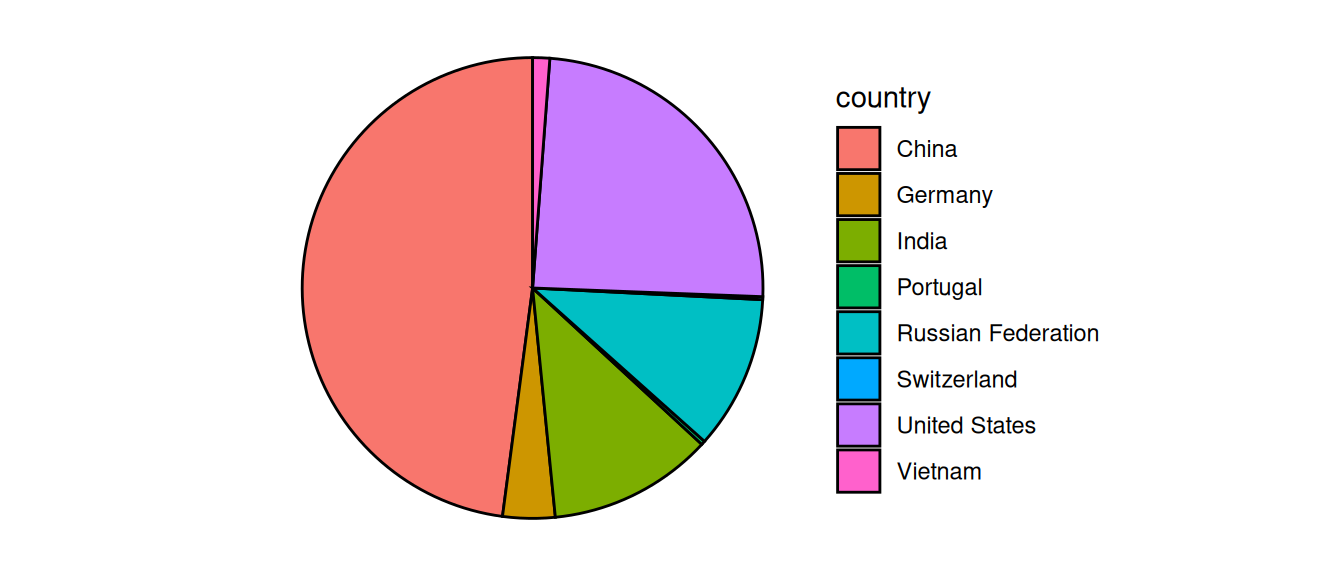
theme_void() entfernt Dekoration (gleich)ggplot(data = d_wb_countries_2012) +
geom_col(mapping = aes(x = 0.5, y = gge, fill = country), color = "black", width = 1) +
scale_x_continuous(limits = c(-1, 1)) + coord_polar(theta = "y") + theme_void()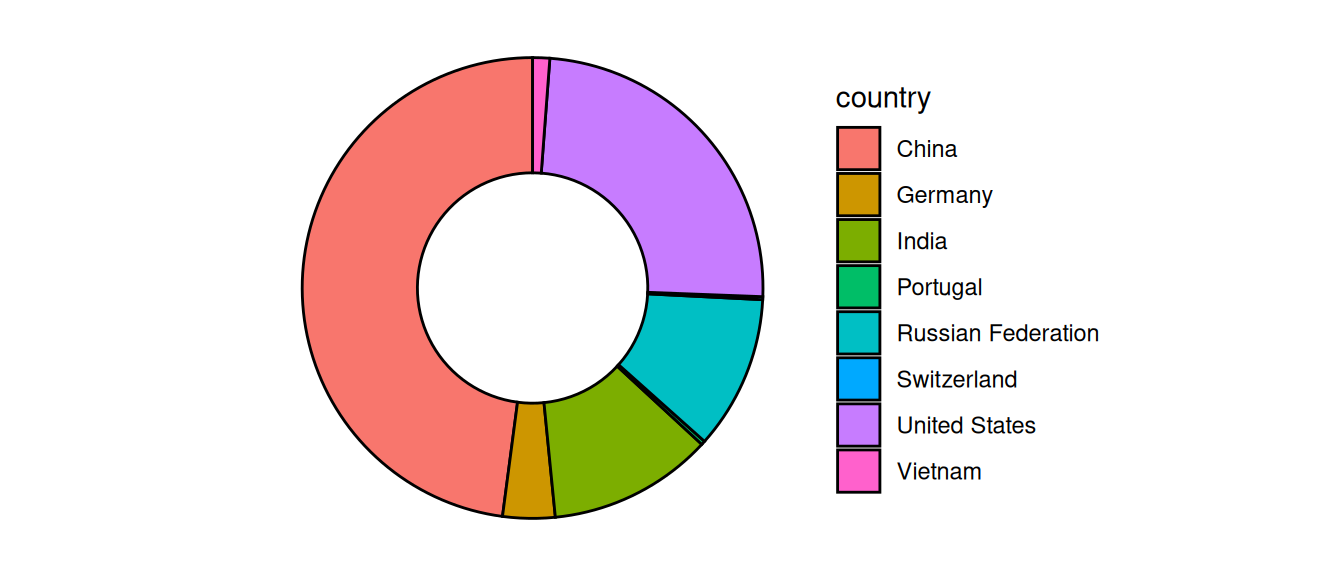
theme_void() entfernt Dekoration (gleich)Voreinstellungen für Graphiken anpassen
theme()ggplot(data = d_wb_2012) +
geom_bar(mapping = aes(x = region, fill = region)) +
theme(
panel.background = element_rect(fill = "pink"),
panel.grid.major = element_line(color = "hot pink")
)
theme() anpassen
theme_void() entfernt allesggthemesGlobale Einstellungen zu Beginn des Dokuments, zum Beispiel:
theme_set(theme_bw())Nicht allen gefallen die grauen Balken…
ggplot(data = d_ns_bochum_monat) +
  geom_histogram(mapping = aes(x = NS), fill = "orange", color = "black")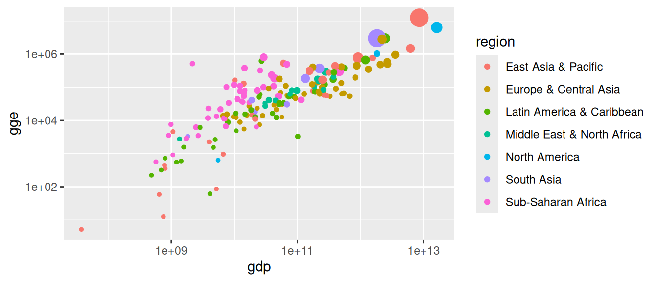
Problem: Viel Arbeit, wenn die Plots einheitlich aussehen sollen
line_color <- "black"
fill_color <- "light blue"
update_geom_defaults("bar",   list(fill = fill_color, color = line_color))
update_geom_defaults("point", list(fill = fill_color, color = line_color))
update_geom_defaults("boxplot", list(fill = fill_color))

## und so weiter
Mit dem Namen einer Farbe
"red" (mehr als 600 vordefinierte Farben)colors() gibt Namen der vordefinierten FarbenMit RGB-Wert
rgb(0, 0.7, 1)Mit Hex-Wert
"#45e32f"ggplot(data = d_wb_2012) +
geom_point(mapping = aes(x = gdp, y = gge, color = region, size = pop)) +
scale_x_log10() + scale_y_log10() +
scale_size(guide = "none")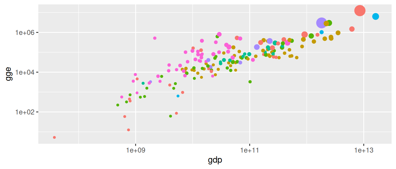
guide = "none" für die Größenskalascale_color_discrete(guide = "none")ggplot(data = d_wb_2012) +
geom_point(mapping = aes(x = gdp, y = gge, color = region, size = pop), show.legend = FALSE) +
scale_x_log10() + scale_y_log10()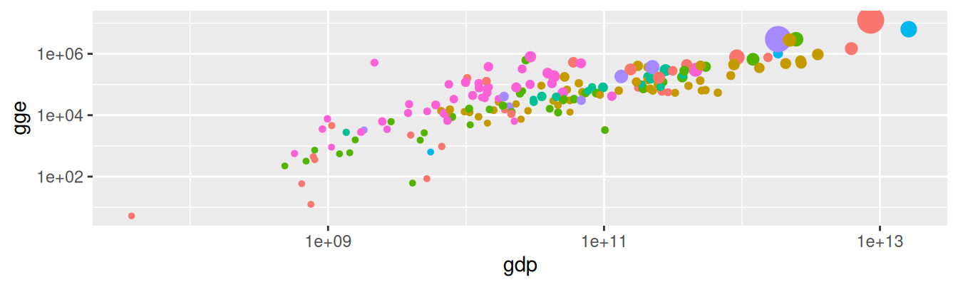
show.legend = FALSE entfernt alle Legenden für ein Geom