7 Untersuchung von zwei Merkmalen in R
Übersicht Dataframes für diese Folien
| Name | Inhalt |
|---|---|
d_svrw |
Jahreswerte für Wirtschaftswachstum und -prognosen vom Sachverständigenrat für Wirtschaft |
d_le_latest |
Lebenserwartung und Entwicklungsindikatoren in verschiedenen Ländern von der Weltbank |
d_pisa |
Pisa-Studie vom OECD |
Quellen: Fahrmeir et al. (2023): Statistik - Der Weg zur Datenanalyse, Weltbank, OECD
Sachverständigenrat für Wirtschaft
| Variable | Inhalt |
|---|---|
Jahr |
Betrachtetes Jahr |
Prognose |
Vom Sachverständigenrat prognostiziertes Wirtschaftswachstum |
Wachstum |
Tatsächlich eingetretenes Wirtschaftswachstum |
Daten Sachverständigenrat Wirtschaft
Weltbank
| Variable | Inhalt |
|---|---|
year |
Jahr |
country |
Land |
le |
Life expectancy at birth, total (years) SP.DYN.LE00.IN |
gdppc |
GDP per capita (current US$) - NY.GDP.PCAP.CD |
edu |
Gov. expenditure on education (% of GDP) - SE.XPD.TOTL.GD.ZS |
he |
Current health expenditure (% of GDP) - SH.XPD.CHEX.GD.ZS |
gini |
GINI index - SI.POV.GINI |
Daten Weltbank
Pisa-Studie
| Variable | Inhalt |
|---|---|
country |
Land |
math |
PISA-Score im Fach Mathematik |
read |
PISA-Score im Bereich Lesekompetenz |
- PISA-Ergebnisse sind Punktwerte auf einer künstlichen Skala, die für sich genommen keine direkte Bedeutung haben
- Aussagekraft entsteht erst durch den Vergleich zwischen Länder
- OECD-Berichte stellen daher häufig Länderranglisten in den Mittelpunkt
Date Pisa-Studie
7.1 Streu- und Blasendiagramme
Prognosen Sachverständigenrat
ggplot(data = d_svrw) +
  geom_point(mapping = aes(x = Prognose, y = Wachstum))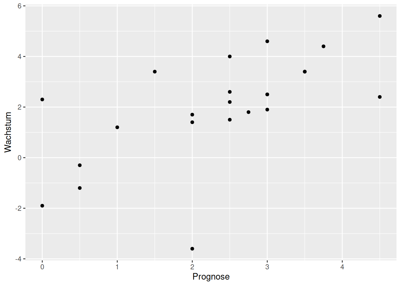
Prognosen Sachverständigenrat erweitert
ggplot(data = d_svrw, mapping = aes(x = Prognose, y = Wachstum)) +
  geom_point(size = 2) + geom_abline(intercept = 0, slope = 1, color = "red") + geom_rug(color = "blue")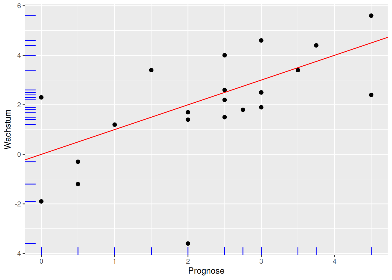
Prognosen Sachverständigenrat erweitert erklärt
- Gerade mit
geom_abline()undinterceptsowieslope - abline für eine Linie mit \(y = a + bx\) mit dem y-Achsenabschnitt \(a\) =
interceptund der Steigung \(b\) =slope - Beobachtungen entlang der Achsen mit
geom_rug()(Blaue Striche) - rug wie Teppich, da die Linien entlang der Achsen aussehen wie die Fransen eines Teppichs
- Mapping für
geom_point()undgeom_rug()(obere Zeile)
Ausgaben Gesundheitswesen und Lebenserwartung
ggplot(data = d_le_latest) +
  geom_point(mapping = aes(x = he, y = le))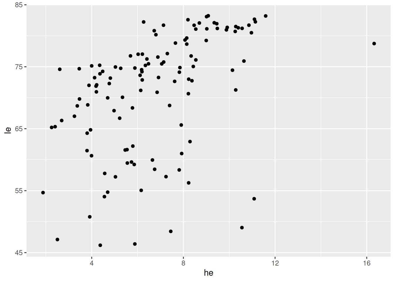
Ausgaben Gesundheitswesen und Lebenserwartung
ggplot(data = d_le_latest) +
  geom_point(mapping = aes(x = he, y = le), shape = 21, fill = "orange")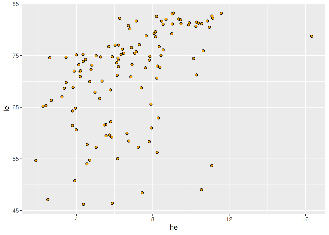
geom_point(): Shapes
Interaktive Diagramme mit plotly
p <- ggplot(data = d_le_latest) + geom_point(mapping = aes(x = he, y = le, label = country), shape = 21, fill = "orange")
ggplotly(p, width = 800, height = 400)- Weitere Informationen anzeigen mit
label=<M> - Funktioniert nur in HTML (und nicht auf Papier)
Beschriftung: Schritt 1
countries <- c("United States", "Sierra Leone", "Sri Lanka")
d_le_latest <- d_le_latest |> mutate(highlight = country %in% countries)
d_le_labels <- d_le_latest |> filter(country %in% countries)- Array (verweis zu Basics) mit interessanten/markanten/… Ländern
mutate(): Länder hervorheben mit Merkmalhighlightfilter(): Zeilen mit anderen Ländern herausfiltern- Dazu später mehr (Verweis auf Stelle)
Beschriftung: Schritt 2
p <- ggplot(mapping = aes(x = he, y = le, label = country)) +
  geom_point(data = d_le_latest, mapping = aes(color = highlight)) +
geom_label(data = d_le_labels, hjust = 0.7, nudge_y = 2, size = 2.5, alpha = 0.5)- Plot in Variable
pspeichern und auf nächster Folie ausgegeben - Farblich hervorheben mit Merkmal
highlight(siehe oben) - Beschriftung hinzufügen mit
geom_label()(Dokumentation!) - Details später (Verweis)
Beschriftung: Darstellung
p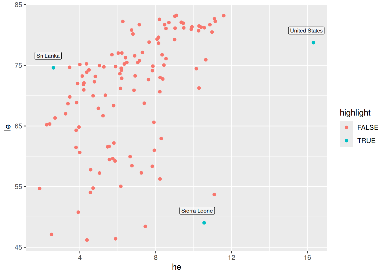
Blasendiagramm
ggplot(data = d_le_latest) +
  geom_point(mapping = aes(x = he, y = le, size = gdppc))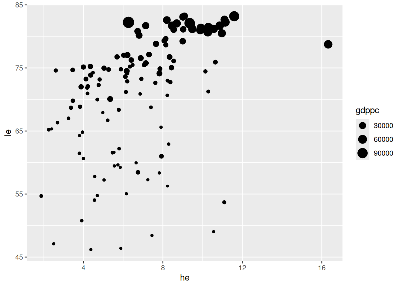
- Skalierung nach BIP pro Kopf
Darstellung von fünf Merkmalen
d <- tibble(A = c(1, 6, 2, 8), B = c(10, 0, 5, 3.75), C = c(16, 2, 8, 4), D = c("a", "b", "b", "a"), E = c("u", "u", "v", "v"))
ggplot(data = d) + geom_point(mapping = aes(x = A, y = B, size = C, color = D, shape = E))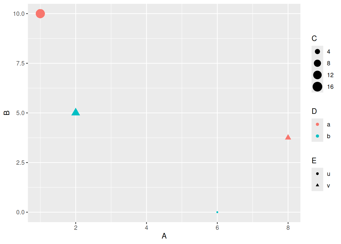
- Hier schwer zu lesen, von Fall zu Fall entscheiden
7.2 Histogramme und Dichtefunktionen
Histogramm 2D (Basisversion)
ggplot(data = d_le_latest) +
  geom_bin2d(mapping = aes(x = he, y = le))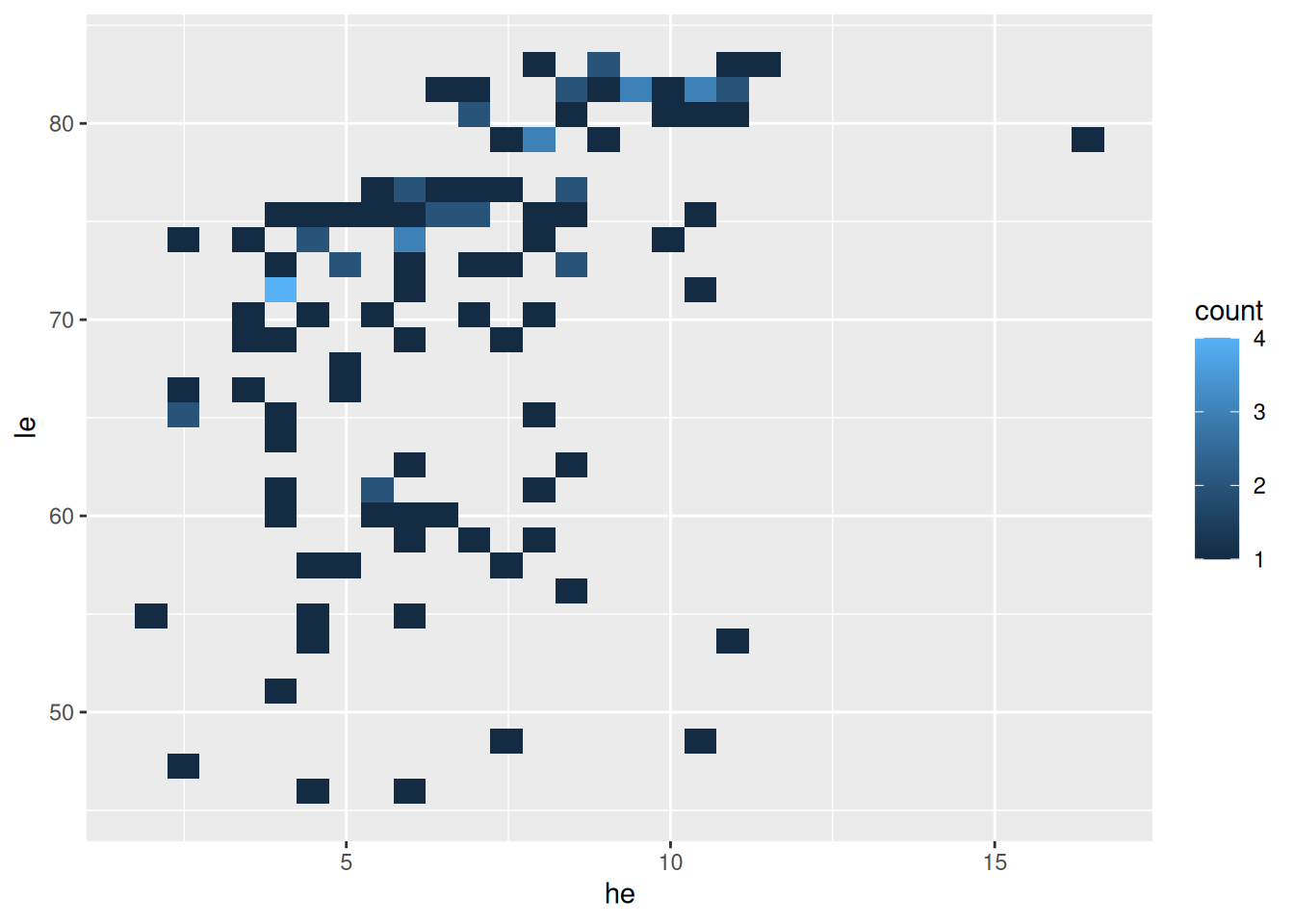
- Histogramm für zwei Merkmale mit
geom_bin2d(...) - bin wie Feld, Zelle, Klasse + 2D (zweidimensional)
Histogramm 2D (mit Klassenbreiten)
ggplot(data = d_le_latest) +
  geom_bin2d(mapping = aes(x = he, y = le), binwidth = c(1, 4))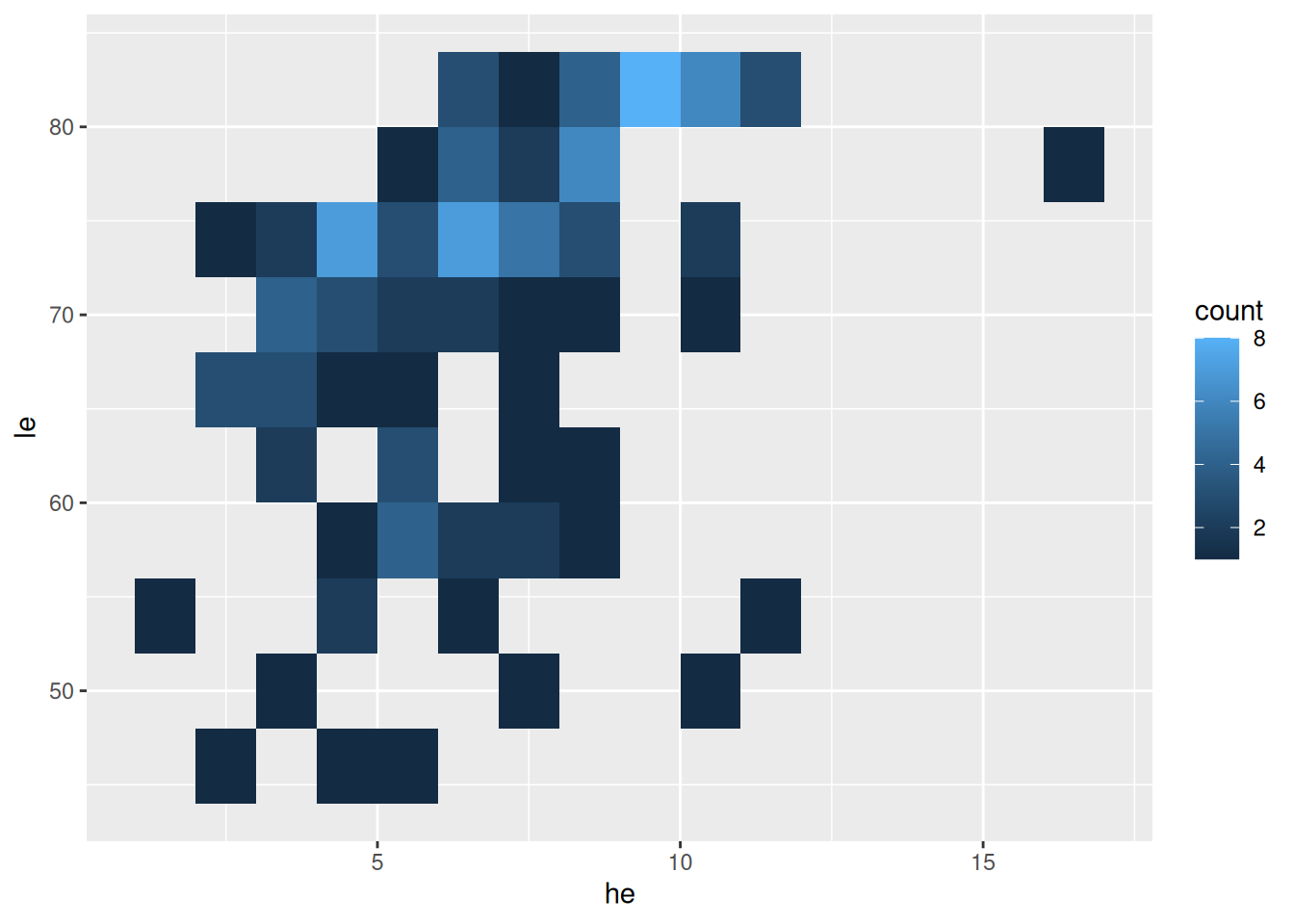
- Klassenbreite mit
binwidth - Werte für beide Richtungen
Alternativ mit Sechsecken
ggplot(data = d_le_latest) +
  geom_hex(mapping = aes(x = he, y = le), binwidth = c(1, 4))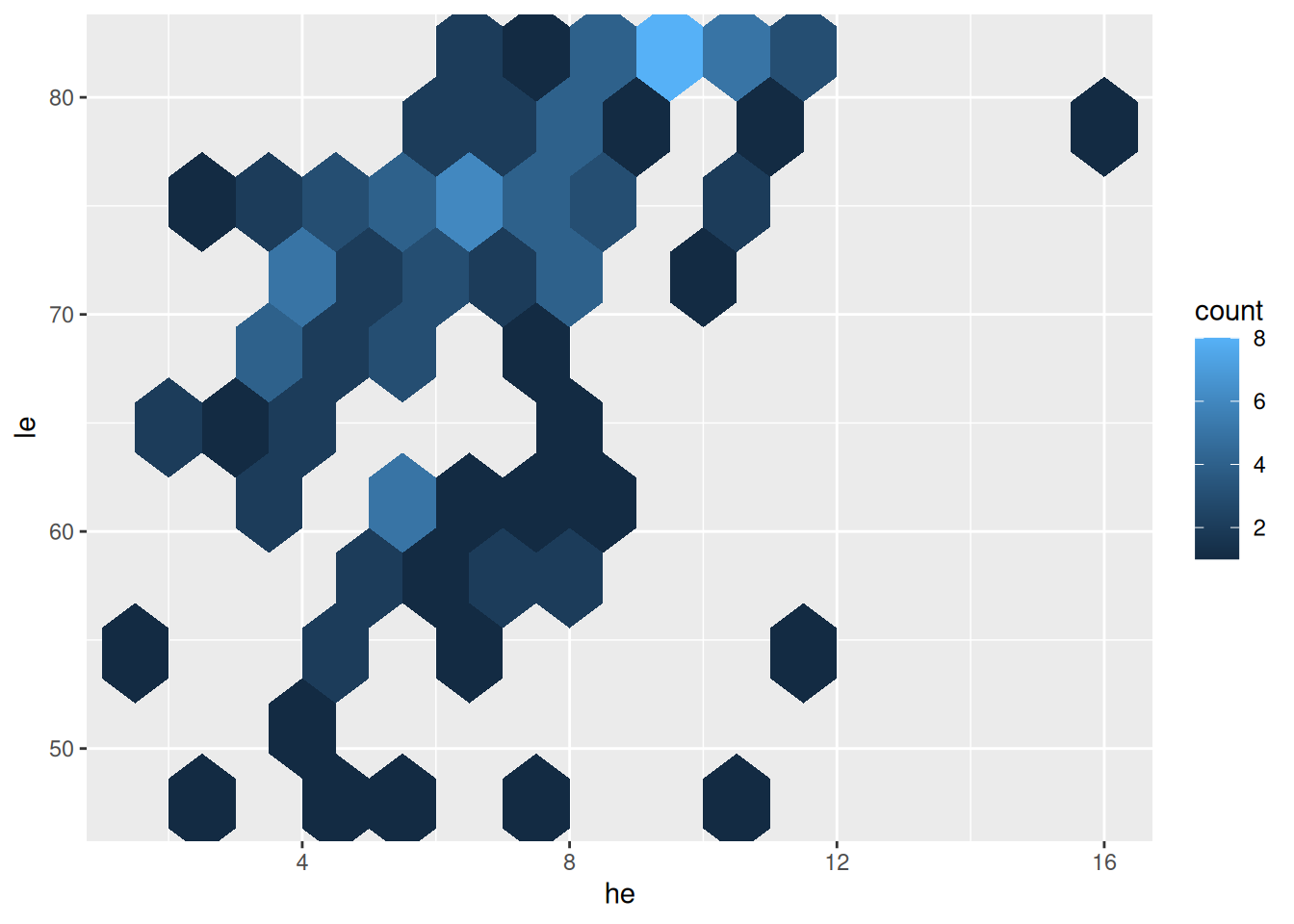
- Unterschied zu vorher:
geom_hex(...)stattgeom_bin2d(...) - hex wie hexagonal
Dichtefunktion
ggplot(data = d_le_latest) +
  geom_density_2d(mapping = aes(x = he, y = le))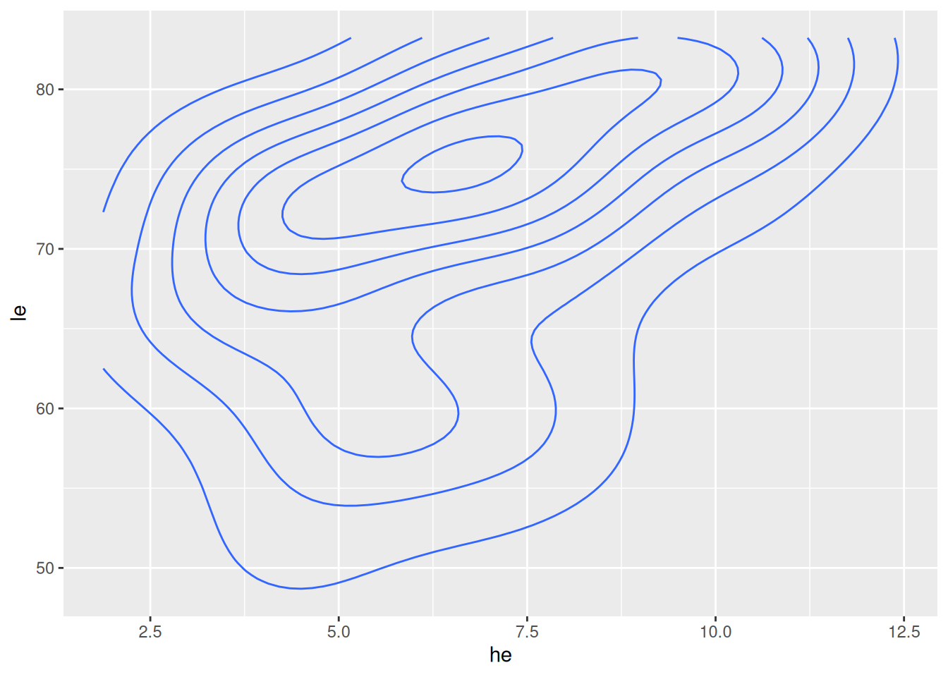
- Höhenlinien geschätzte Dichtefunktion mit
geom_density_2d(...)
Dichtefunktion gefüllt
ggplot(data = d_le_latest) +
  geom_density_2d_filled(mapping = aes(x = he, y = le))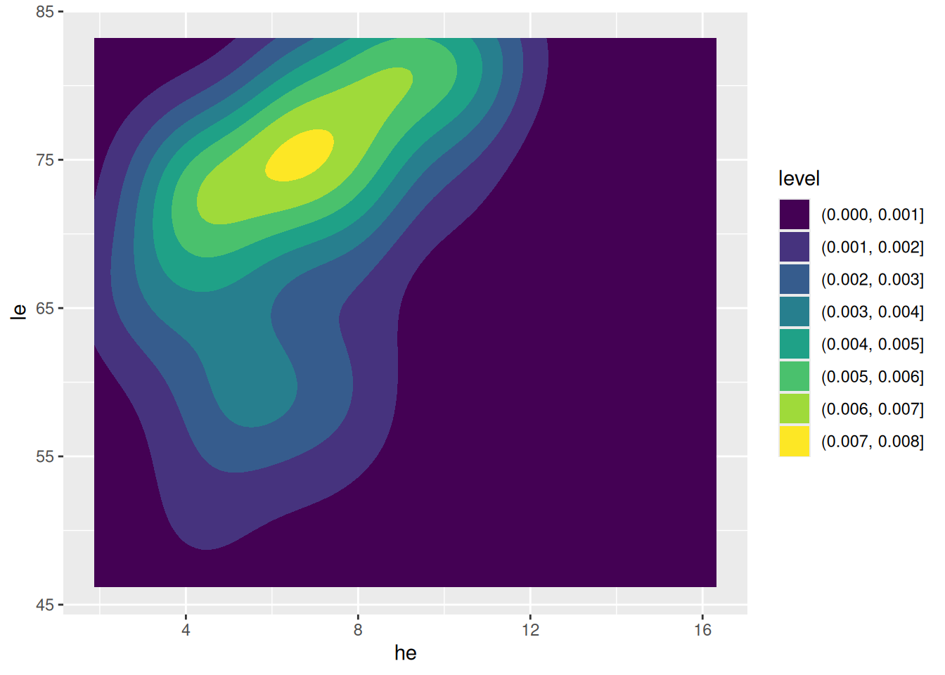
- Farben nach Dichtefunktion mit
geom_density_2d_filled(...)
7.3 Korrelationskoeffizient
Korrelationskoeffizient berechnen
d <- tibble(X = c(1, 3, 4, 8), Y = c(2, 3, 3.5, 5.5))
cor(d$X, d$Y)
[1] 1- Korrelationkoeffizient \(r\) für Werte
xundymitcor(x, y)
Zugehöriger Plot
ggplot(data = d, mapping = aes(x = X, y = Y)) +
  geom_vline(xintercept = mean(d$X), color = "orange") +
  geom_hline(yintercept = mean(d$Y), color = "orange") +
  geom_smooth(formula = y ~ x, method = "lm", linewidth = 0.25) +
  geom_point(size = 3)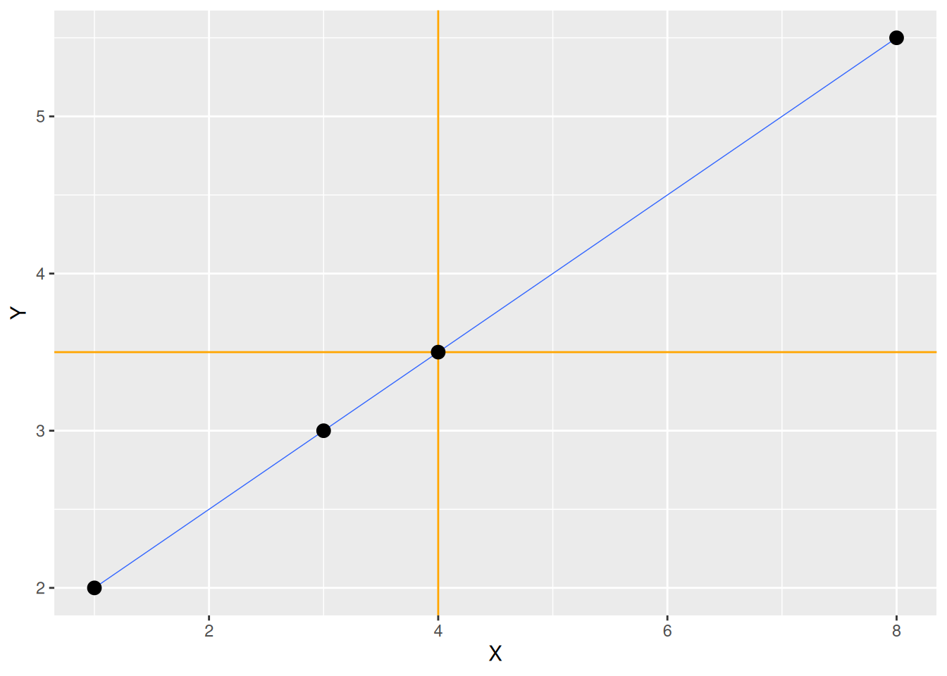
Korrelationskoeffizienten von Beispieldaten (1/3)
Wirtschaftsprognosen
cor(d_svrw$Prognose, d_svrw$Wachstum)[1] 0.6367805\(\rightarrow\) Mittlere Korrelation
Pisa-Studie
cor(d_pisa$read, d_pisa$math)[1] 0.939363\(\rightarrow\) Starke positive Korrelation
Korrelationskoeffizienten von Beispieldaten (2/3)
Gesundheitsausgaben und Lebenserwartung
cor(d_le_latest$he, d_le_latest$le)[1] 0.4420217
Gini-Koeffizient und Lebenserwartung
cor(d_le_latest$gini, d_le_latest$le)[1] -0.4759603\(\rightarrow\) Mittlere negative Korrelation
Korrelationskoeffizienten von Beispieldaten (3/3)
BIP pro Kopf und Lebenserwartung
cor(d_le_latest$gdppc, d_le_latest$le)[1] 0.617262
BIP pro Kopf (logarithmisch) und Lebenserwartung
cor(log10(d_le_latest$gdppc), d_le_latest$le)[1] 0.86165887.4 Lineare Regression
Rechenbeispiel
Berechnung der Ausgleichsgeraden
d <- tibble(X = c(1, 2, 3), Y = c(1, 5, 3))
xm <- mean(d$X)
ym <- mean(d$Y)
betaD <- sum((d$X - xm) * (d$Y - ym)) / sum((d$X - xm)^2)
alphaD <- ym - betaD * xm- Rechenoperationen werden für Vektoren elementweise ausgeführt (anders als in Matlab)
- Elemente eines Vektors aufsummieren mit
sum() - Dazu später mehr (Verweis)
Plot der Ausgleichsgeraden
ggplot(data = d) +
  geom_abline(intercept = alphaD, slope = betaD, color = "orange", size = 1) +
  geom_point(mapping = aes(x = X, y = Y), size = 3)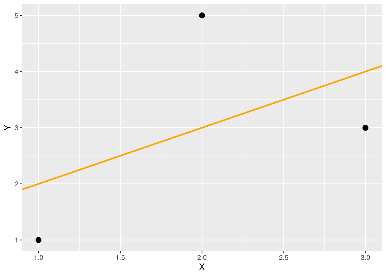
Ausgleichsgerade mit geom_smooth()
ggplot(data = d, mapping = aes(x = X, y = Y)) +
  geom_smooth(formula = y ~ x, method = "lm", se = FALSE, color = "orange") +
  geom_point(size = 3)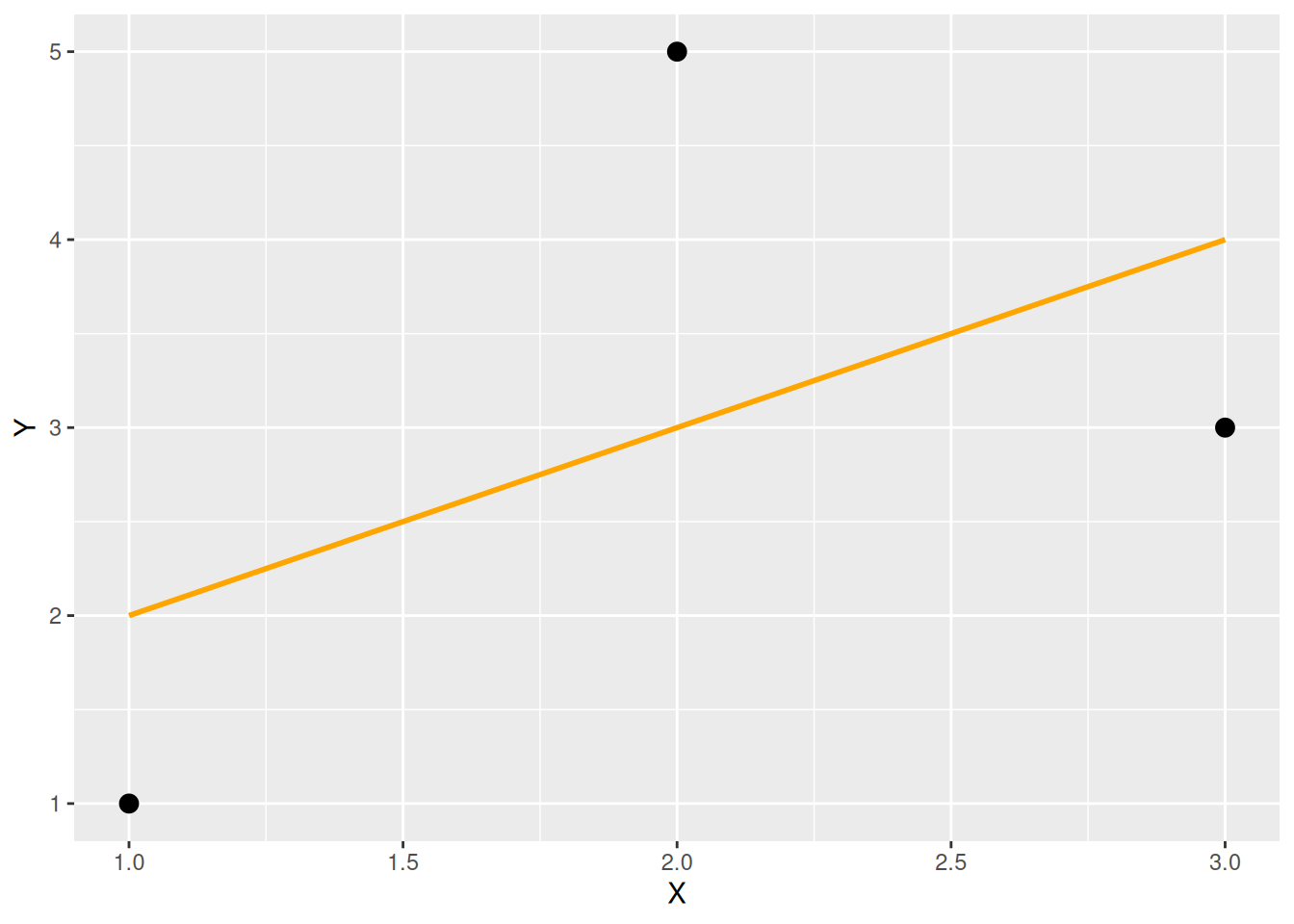
Ausgleichskurven mit LOESS, Beispiel 1
d <- tibble(X = 10 * runif(300), Y = sin(2 * pi * X / 10) + 0.2 * rnorm(300))
ggplot(data = d, mapping = aes(x = X, y = Y)) +
  geom_point() + geom_smooth(formula = y ~ x, method = "loess", se = FALSE)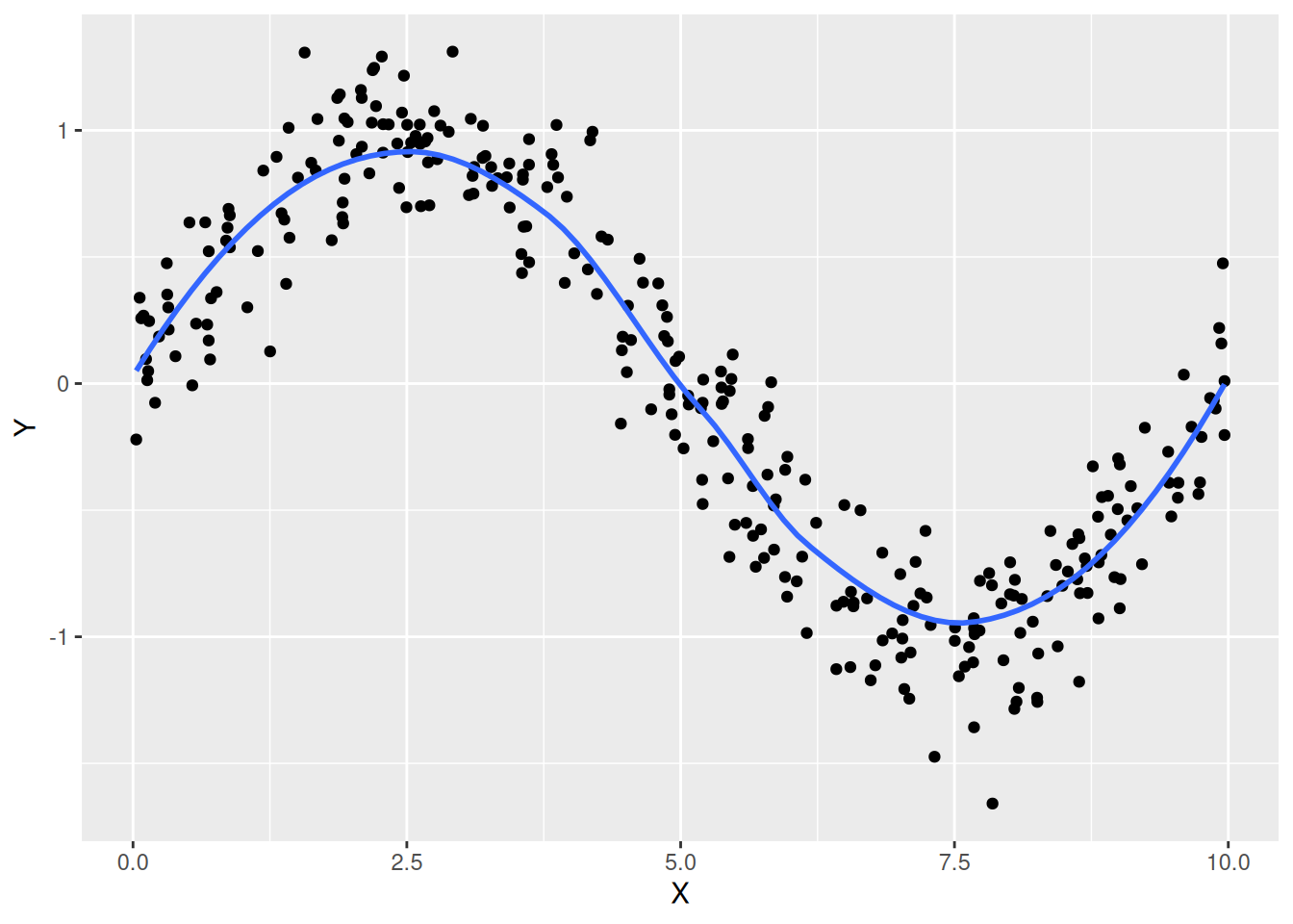
Ausgleichskurven mit LOESS, Beispiel 2
d <- tibble(X = 10 * runif(20), Y = sin(2 * pi * X / 10) + 0.2 * rnorm(20))
ggplot(data = d, mapping = aes(x = X, y = Y)) +
  geom_point() + geom_smooth(formula = y ~ x, method = "loess", se = TRUE)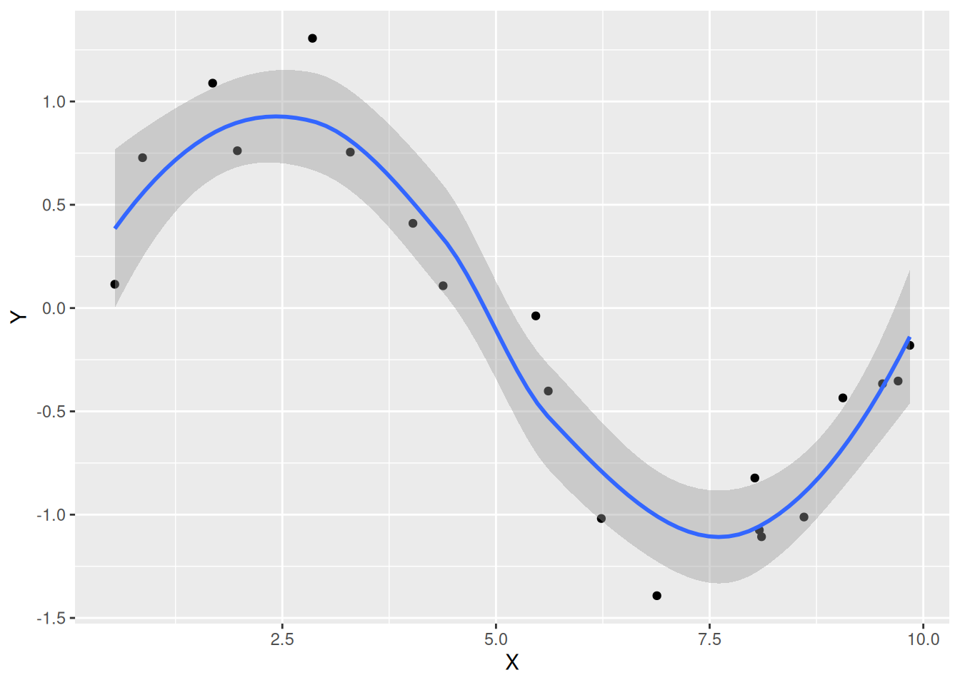
- LOESS: Locally Estimated Scatterplot Smoothing
- Konfidenzintervall anzeigen mit
se = TRUE - Auskunft darüber, wie vertrauenswürdig die berechnete Kurve ist
7.5 Zusammenfassung
geom_point()
| AES/Argument | Beschreibung | Optional |
|---|---|---|
| x | Merkmal für x-Position | Nein |
| y | Merkmal für y-Position | Nein |
| shape | Form (nur qualitative Merkmale) | Ja |
| size | Größe (nur stetige Merkmale) | Ja |
| alpha | Transparenz (nur stetige Merkmale) | Ja |
| color | Farbe | Ja |
| fill | Füllfarbe für Shapes 21 ‒ 24 | Ja |
Geglättete Daten mit geom_smooth()
ggplot(data = <DATAFRAME>) +
geom_smooth(mapping = aes(x = <M>, y = <M>), Argumente)| AES | Beschreibung | Optional |
|---|---|---|
| x | Merkmal für x-Achse | Nein |
| y | Merkmal für y-Achse | Nein |
| Argumente | Beschreibung | Optional |
|---|---|---|
| formula | In der Regel y ~ x |
Nein |
| method | Methode (Linear mit "lm", LOESS mit "loess") |
Ja |
| se | Konfidenzintervall anzeigen (TRUE oder FALSE) |
Ja |
| color | Farbe | Ja |
| size | Linienstärke | Ja |