6 Dichtekurven und Normalverteilung
Übersicht Dataframes für diese Folien
| Name | Inhalt |
|---|---|
d_ns_m |
Monatswerte für Niederschläge in Bochum |
Quelle: https://www.dwd.de
6.1 Normalverteilung
Exkurs: Funktionen erzeugen
Eigene Funktionen
f1 <- function(x) { x^2 }
f1(2)
[1] 4- Funktion
f1berechnetx^2 - Dabei ist
function(x) x^2die Funktion mit dem Namenf1
Normalverteilung mit \(\mu = 1\) und \(\sigma = 2\)
f2 <- function(x) { dnorm(x, mean = 1, sd = 2) }
f2(0)
[1] 0.1760327- Normalverteilung mit
dnorm(x, mean = mu, sd = sigma) - Stelle
x, Mittelwertmuund Standardabweichungsigma
Funktion plotten mit geom_function()
Beispiel 1
f1 <- function(x) x^2
ggplot() +
  geom_function(fun = f1)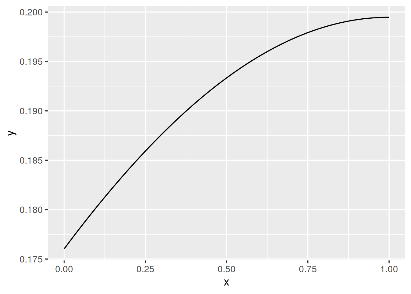
Beispiel 2
f2 <- function(x) dnorm(x, mean = 1, sd = 2)
ggplot() +
  geom_function(fun = f2)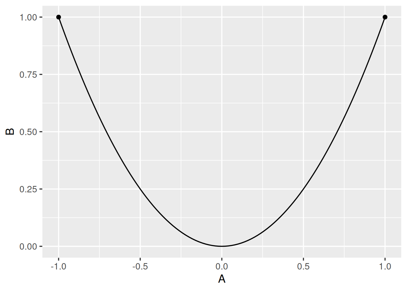
geom_function()plottet Kurve ohne Mapping- Funktion angeben mit
fun = <Funktion>
→ Plotbereich nicht gut gewählt
Plotbereich festlegen 1/2
ggplot(data = tibble(A = c(-8, -1, 1, 3, 10), B = f2(A))) +
  geom_function(fun = f2) +
  geom_point(mapping = aes(x = A, y = B))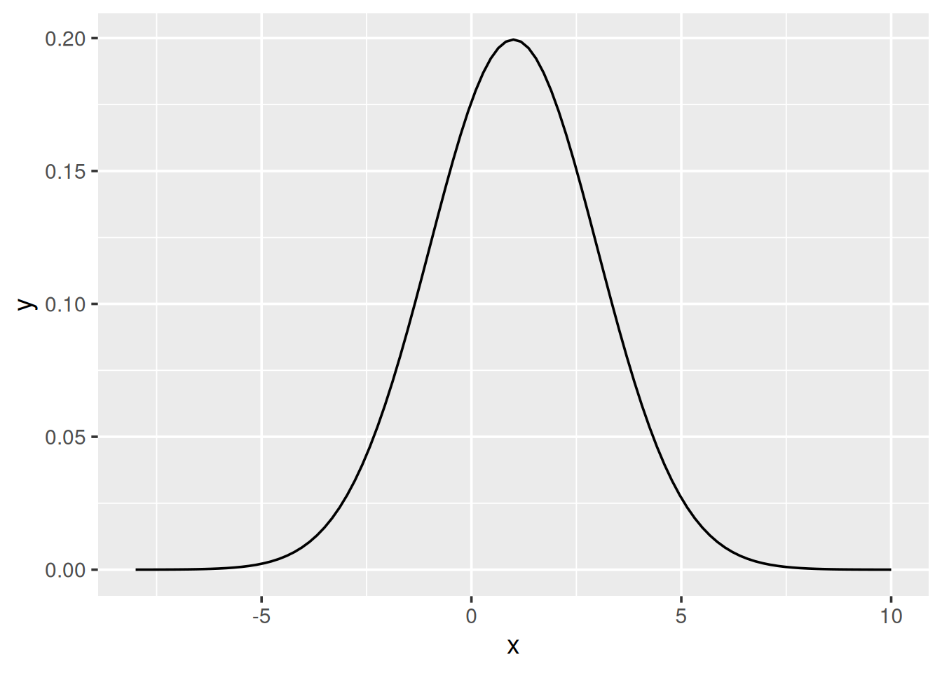
- Plotbereich aus Daten zu zweitem Geom (zum Beispiel Punkte)
Plotbereich festlegen 2/2
ggplot() +
  geom_function(fun = f2) +
  lims(x = c(-8, 10))
- Bereich mit
lims(x = c(xmin, xmax))explizit angeben
Funktion plotten mit geom_ribbon()
ggplot() +
  geom_ribbon(
    fun = f2, stat = "function",
    mapping = aes(x = after_stat(x), ymin = 0, ymax = after_stat(y)),
    color = "black", fill = "linen", alpha = 0.5
  ) +
  lims(x = c(-8, 10))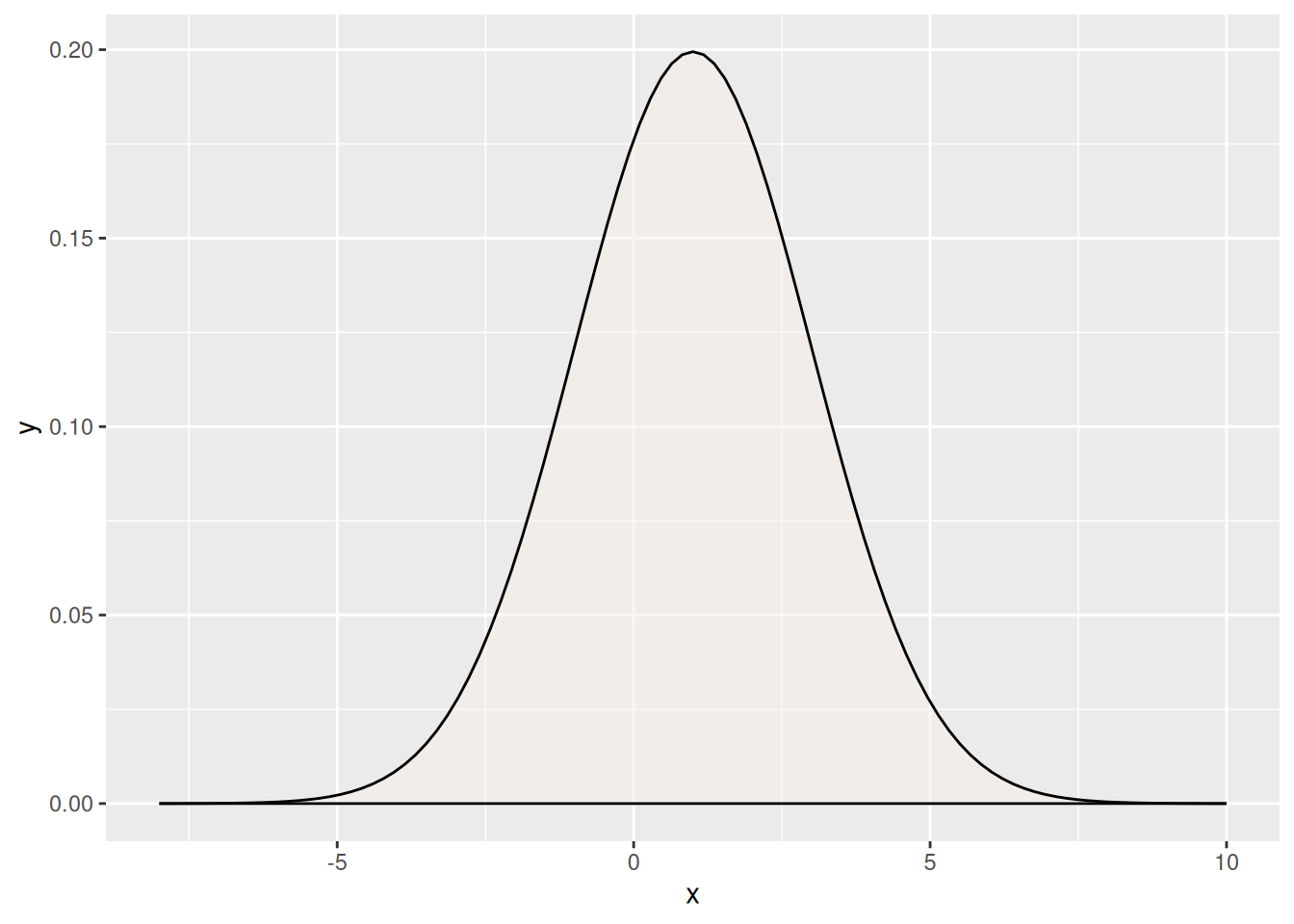
- Mit
stat = "function"Funktion plotten - Mapping mit
xundyausafter_stat(x)undafter_stat(y)
Histogramm mit Normalverteilung Niederschläge 1/2
Mittelwert und Standardabweichung der Stichprobe berechnen
mu <- mean(d_ns_m$Niederschlag)
sigma <- sd(d_ns_m$Niederschlag)
Funktion f für Normalverteilung x mit mu und sigma
f <- function(x) dnorm(x, mean = mu, sd = sigma)Histogramm mit Normalverteilung Niederschläge 2/2
ggplot(data = d_ns_m) +
  geom_histogram(mapping = aes(x = Niederschlag, y = after_stat(density)), binwidth = 10, boundary = 0) +
  geom_function(fun = f, color = "red", linewidth = 1)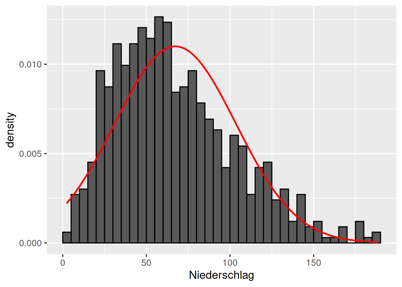
- Angaben zu Histogramm wie gehabt
- Funktion
fvorher erzeugt (vorherige Folie)
Kontrolle: Normal-Quantil-Plot
ggplot(data = d_ns_m, mapping = aes(sample = Niederschlag)) +
  geom_qq_line(color = "red", linewidth = 1) +
  geom_qq()
- Normal-Quantil-Plot mit
geom_qq()undgeom_qq_line() - Mapping als Argument in
ggplot()gilt für alle Geoms
6.2 Approximierte Dichtefunktionen
Dichtefunktion Niederschläge
ggplot(data = d_ns_m, mapping = aes(x = Niederschlag)) +
  geom_histogram(mapping = aes(y = stat(density)), binwidth = 10, boundary = 0) +
  geom_density(color = "red", linewidth = 1) +
  lims(x = c(-20, 220))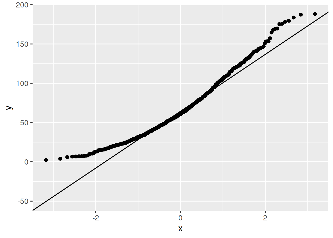
- Approximierte Dichtefunktion
geom_density()
Dichtefunktion Niederschläge
ggplot(data = d_ns_m, mapping = aes(x = Niederschlag)) +
  geom_histogram(mapping = aes(y = stat(density)), binwidth = 10, boundary = 0) +
  geom_density(color = "red", linewidth = 1, fill = "linen", alpha = 0.5) +
  lims(x = c(-20, 220))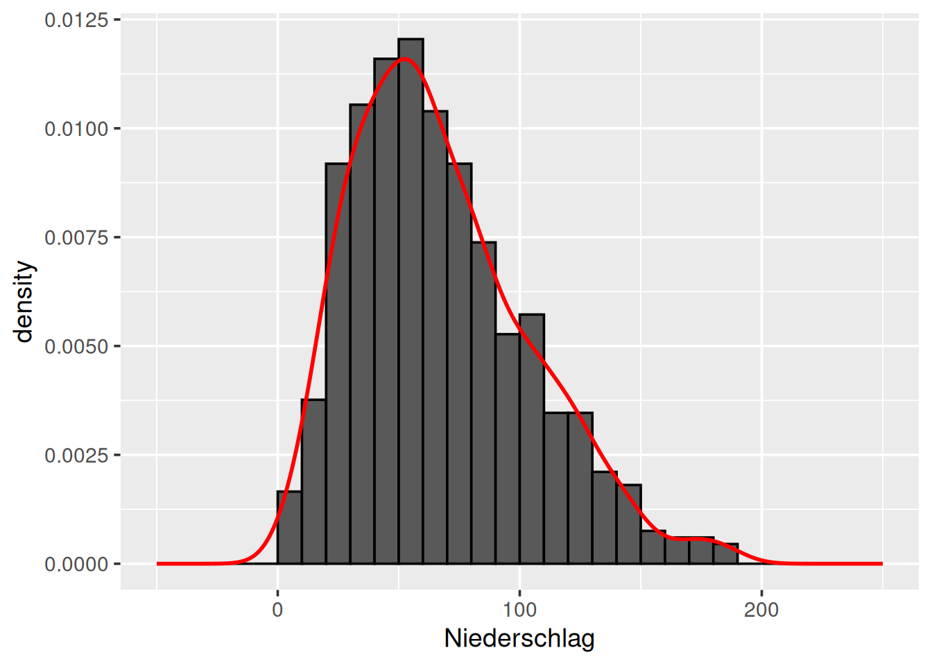
- Füllen mit Farbe
fill = <Farbe>und Transparenzalpha = <Wert>
Dichtefunktion Niederschläge
ggplot(data = d_ns_m, mapping = aes(x = Niederschlag)) +
  geom_histogram(mapping = aes(y = stat(density)), binwidth = 10, boundary = 0) +
  geom_density(bw = 2, linewidth = 1, color = "orange") +
  geom_density(bw = 4, linewidth = 1, color = "blue") +
  geom_density(bw = 8, linewidth = 1, color = "red") +
  lims(x = c(-20, 220))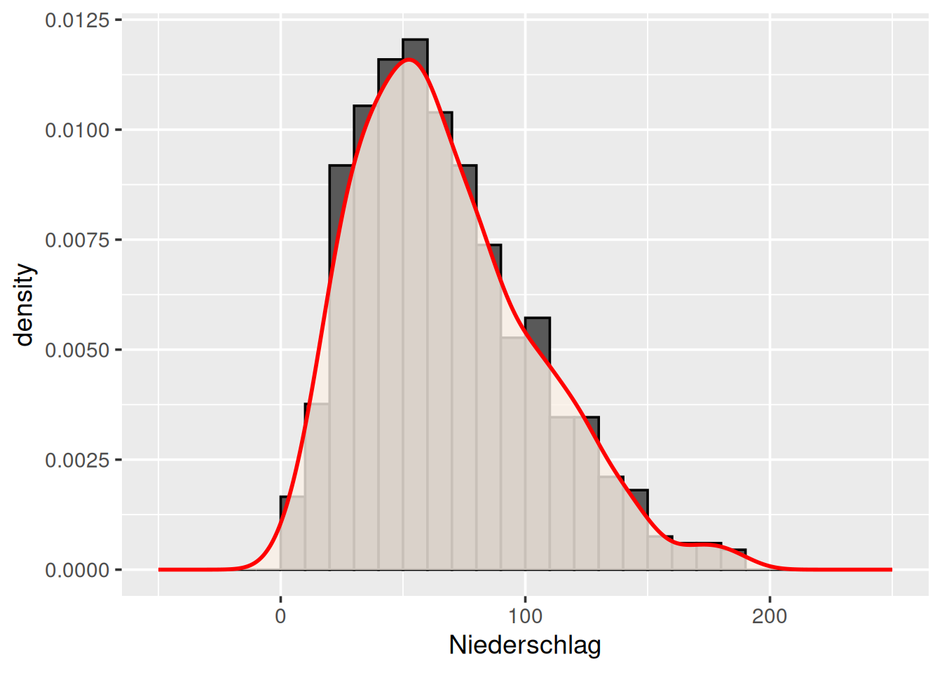
- Argument
bw = <Wert>legt die Breite des Kerns fest (bw = bandwidth) - Je größer
bwumso glatter die Kurve
Dichtefunktion in Monaten
ggplot(data = d_ns_m) +
  geom_density(mapping = aes(x = Niederschlag, fill = Monat), alpha = 0.25)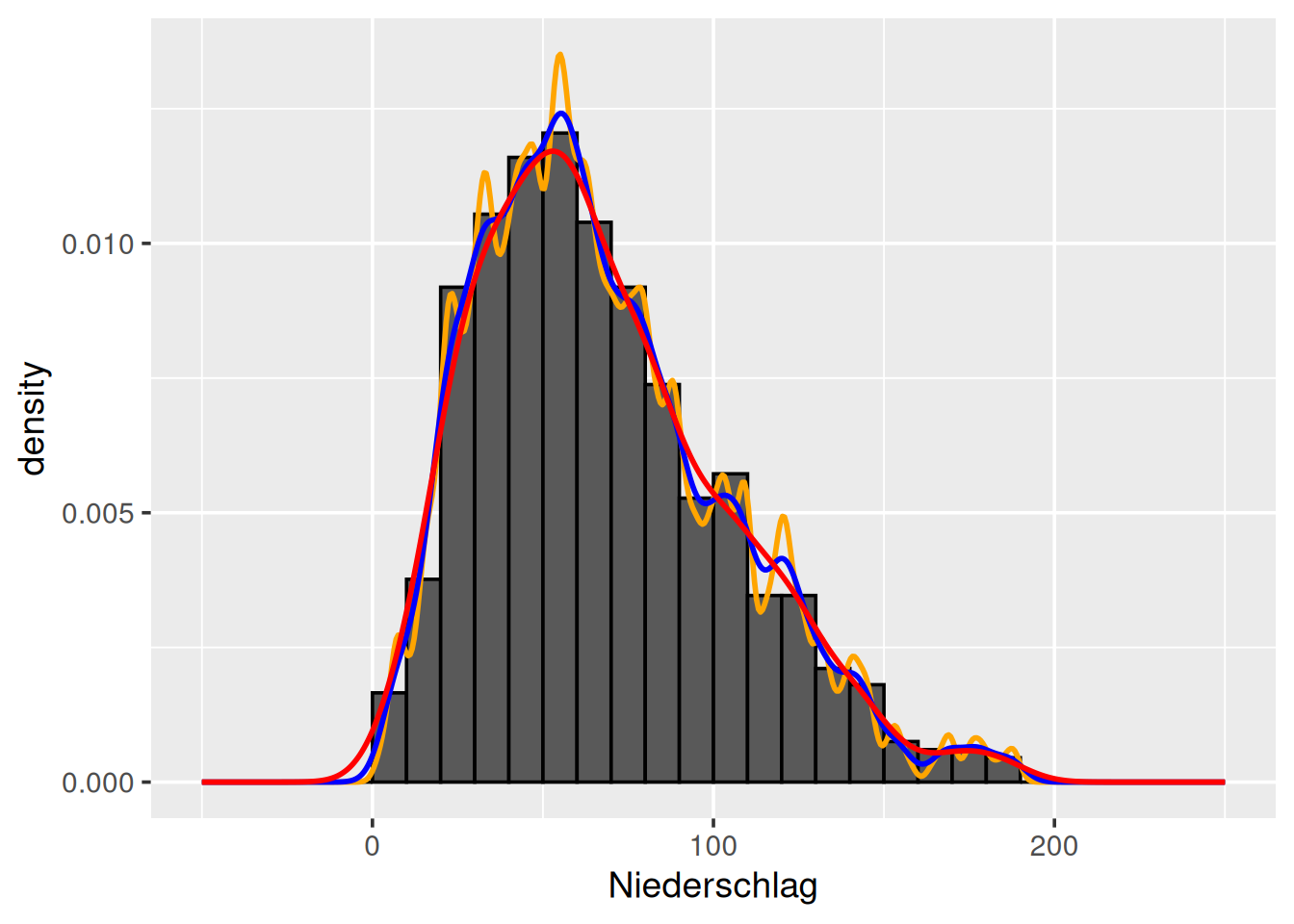
- Füllfarbe nach Monat
- Transparenz wieder mit
alpha
Dichtefunktionen untereinander (Paket ggridges)
ggplot(data = d_ns_m) +
  geom_density_ridges(mapping = aes(x = Niederschlag, y = Monat), bandwidth = 10)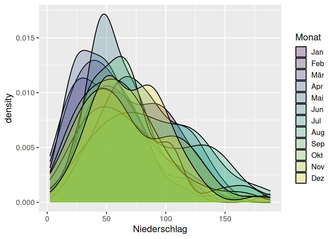
- Geom
geom_density_ridges()wiegeom_density()aber untereinander - Kernbreite mit
bandwidth = <Wert>angeben
Violinenplot
ggplot(data = d_ns_m) +
  geom_violin(mapping = aes(x = 0, y = Niederschlag))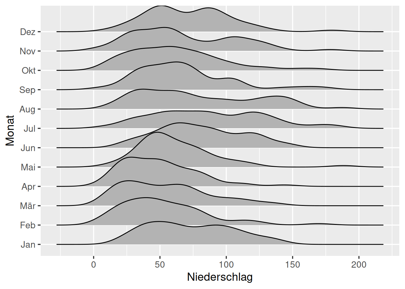
- Ähnlich Boxplot, aber mit Kurven
Violinenplot
ggplot(data = d_ns_m) +
  geom_violin(mapping = aes(x = Monat, y = Niederschlag))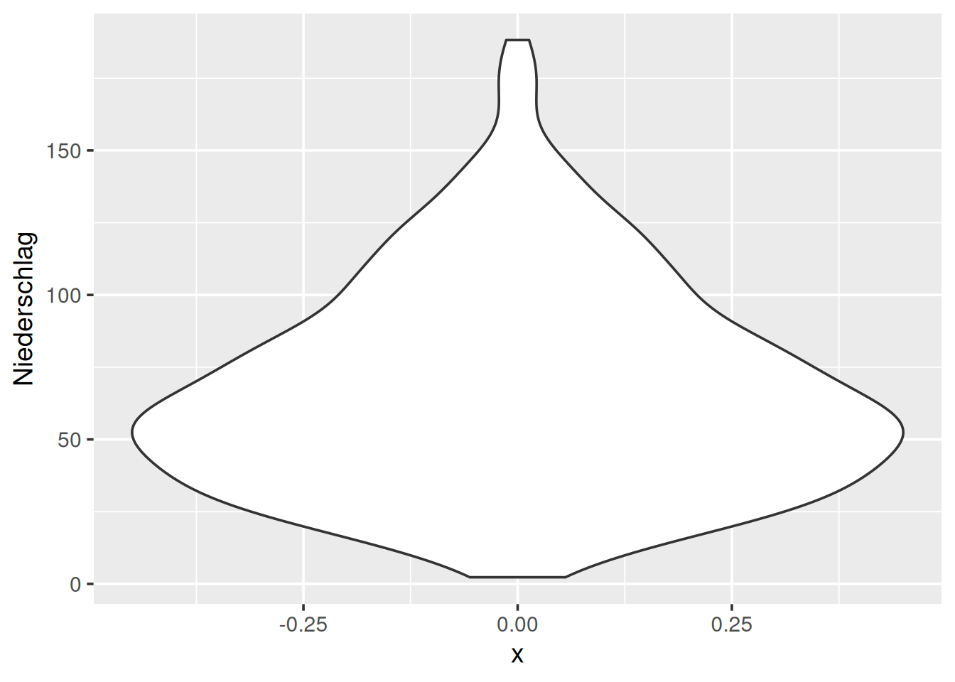
- Charakteristika der Monate ablesbar
6.3 Zusammenfassung
Funktionen definieren
Normale Funktion
f <- function(x) sin(x^2)Normalverteilung
mu <- mean(<Vektor>)
sigma <- sd(<Vektor>)
f <- function(x) dnorm(x, mu, sigma)
Funktionen plotten mit geom_function()
ggplot() +
geom_function(stat = "function", fun = <Funktion>, xlim = c(<from>, <to>), Argumente)- Funktion vorab definieren
- Plotbereich mit
xlimfestlegen - Argumente für
geom_line, z.B.linewidth
Funktionen plotten mit geom_ribbon()
ggplot() +
  geom_ribbon(
    mapping = aes(x = after_stat(x), ymin = 0, ymax = after_stat(y)),
    stat = "function", fun = <Funktion>, xlim = c(<from>, <to>), Argumente
)- Mapping mit Werten, die das
statberechnet (hier:xundy) - Sonst wie
geom_function()
Dichtefunktion mit geom_density()
ggplot(data = <DATAFRAME>) +
geom_density(mapping = aes(x = <M>, ...), Argumente)| AES | Beschreibung | Optional |
|---|---|---|
| x | Merkmal für Dichte | Nein |
| AES/Argumente | Beschreibung | Optional |
|---|---|---|
| color | Farbe der Linie | Ja |
| fill | Füllfarbe | Ja |
| alpha | Transparenz der Füllfarbe | Ja |
| Argumente | Beschreibung | Optional |
|---|---|---|
| kernel | Art des Kerns (“gaussian”, “epanechnikov”, “cosine”, …) | Ja |
| bw | Glättungsbreite h | Ja |
Normal-Quantil-Plot
ggplot(data = <Dataframe>) +
  geom_qq(mapping = aes(sample = <M>), Argumente) +
  geom_qq_line(mapping = aes(sample = <M>), Argumente)
| AES | Beschreibung | Optional |
|---|---|---|
| sample | Merkmal mit Daten | Nein |
| Argumente | Beschreibung | Optional |
|---|---|---|
| color | Farbe | Ja |
Dichtefunktionen untereinander
ggplot(data = <Dataframe>) +
geom_density_ridges(mapping = aes(x = <M>, y = <M>, ...), bandwidth = bw)| AES | Beschreibung | Optional |
|---|---|---|
| x | Merkmal für Dichte | Nein |
| y | Merkmal einzelne Plots | Nein |
| AES/Argumente | Beschreibung | Optional |
|---|---|---|
| color | Farbe der Linie | Ja |
| fill | Füllfarbe | Ja |
| alpha | Transparenz der Füllfarbe | Ja |
| Argumente | Beschreibung | Optional |
|---|---|---|
| bandwidth | Glättungsbreite h | Ja |
Violinenplot
→ Wie Boxplot